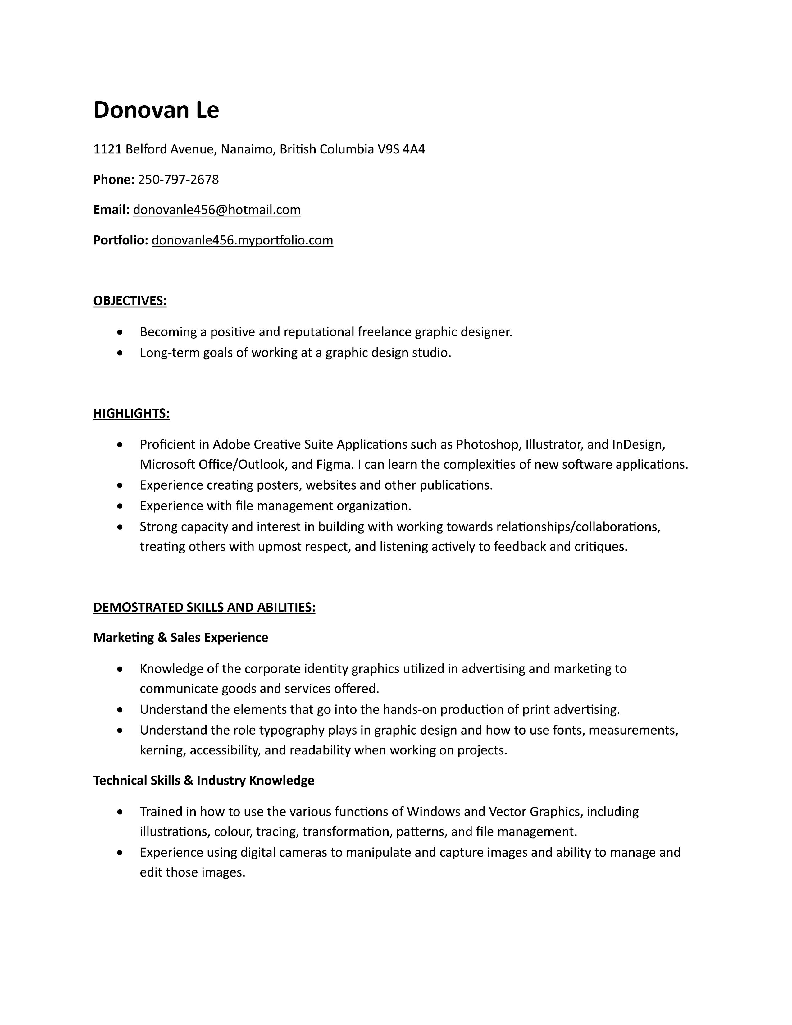
Welcome to 'IVRA'

'IVRA' is my brand where having clear information is valued higher than visual appearance.Founded in 2026, I imagine a design language that's focuses in on simplistic design language of boxes and rectangles while still conveying a clear message where legibility plays a huge part in my design. Everything is straight to the point, and (hopefully) easy to navigation your way around my portfolio.Ready to browse around? Click on one of the links to navigate through my portfolio, and thanks for checking it out!

Want to know a little more about myself?
Hey there, I'm Donovan! A graphic designer from Nanaimo, B.C. and I keep my energy going by having a Tim Hortons Ice Capp once a week (and maybe more).I've started to become a graphic designer 4 years ago, and I have learned a lot about the recommended programs that are required in the industry during those times. Becoming a freelancer has been challenging since you meet a wide spectrum of clients who can vary on what they want and what they need.I strive to improve myself overtime and gain any new skills I can get mt hands on. Any experience may not be required, but good to keep on the back of my mind for future reference. I'll be willing to learn and do my best in fulfilling the requirements you may need!
If you wish to contact us, I am available via e-mail.
E-Mail: [email protected]
Highlights
Here are a few of my projects that I considered are my best work during my career. These have in-depth photos explaining the process, any highlights I will mention, and a rationale that discusses my goal, challenge, and accomplishment.


Personal Projects
If there's no client work I have at the moment or just need a spark of motivation, I usually spend my time developing on things I really want to do.Here are some of my personal projects that I have done in the past to show a variety of things that I am capable of doing.


See my Resume
Need to see my talents and skills? I have posted my resume on my portfolio for easy viewing.Alternatively, if you require a .pdf varient of my resume, I have also included that in the link below!
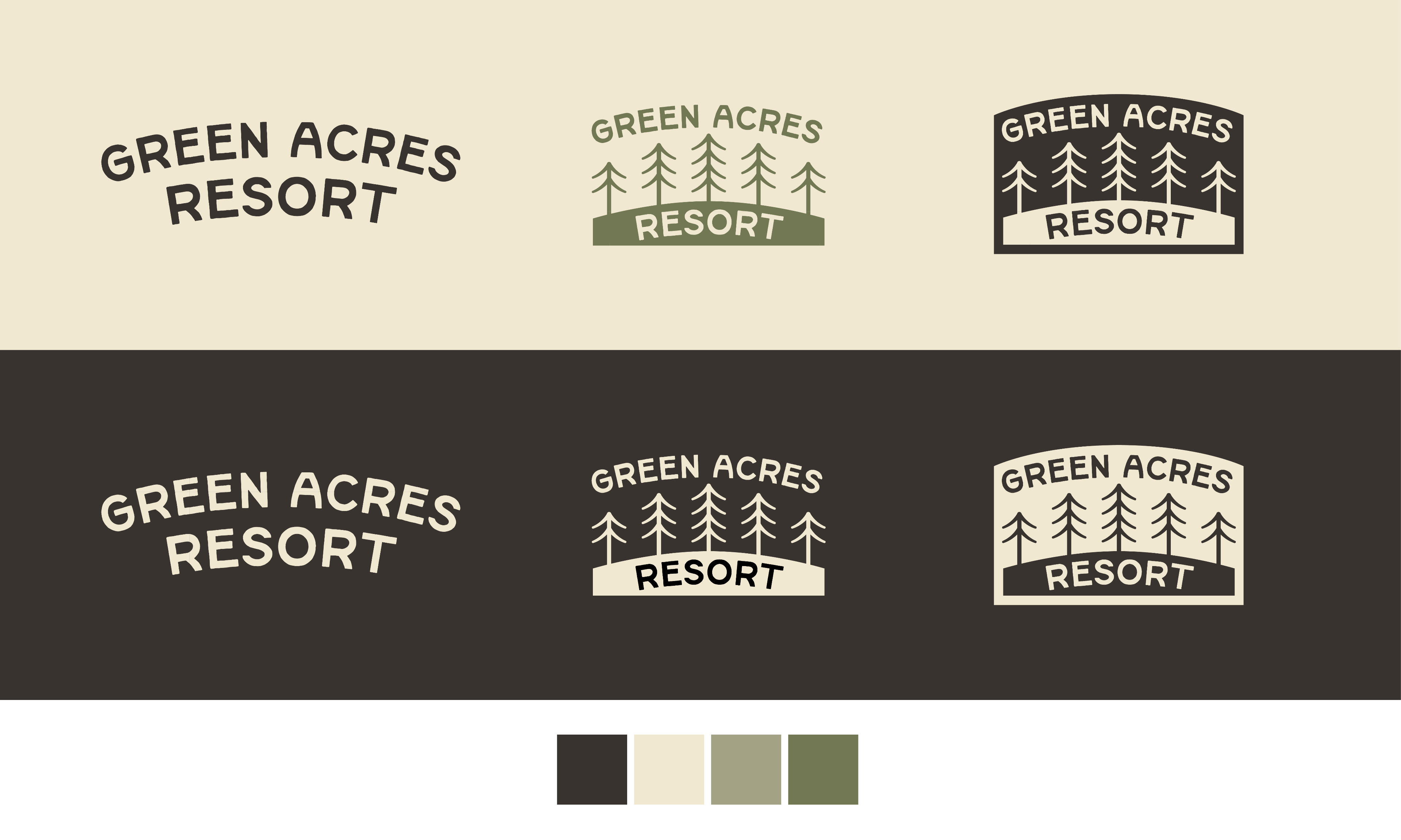
Green Acres Resort
Green Acres Resort is located on Salt Spring Island and I was tasked with this project to discuss how I tackle branding & logo design. How did I come across Green Acres Resort to turn their brand image into being consistent?
Challenges I Faced
The challenges that I came across when studying about Green Acres Resort were the logo. It looks simple and clean, but I feel like it can be heavily reworked regarding the typeface and how it will display on both their website and signage.
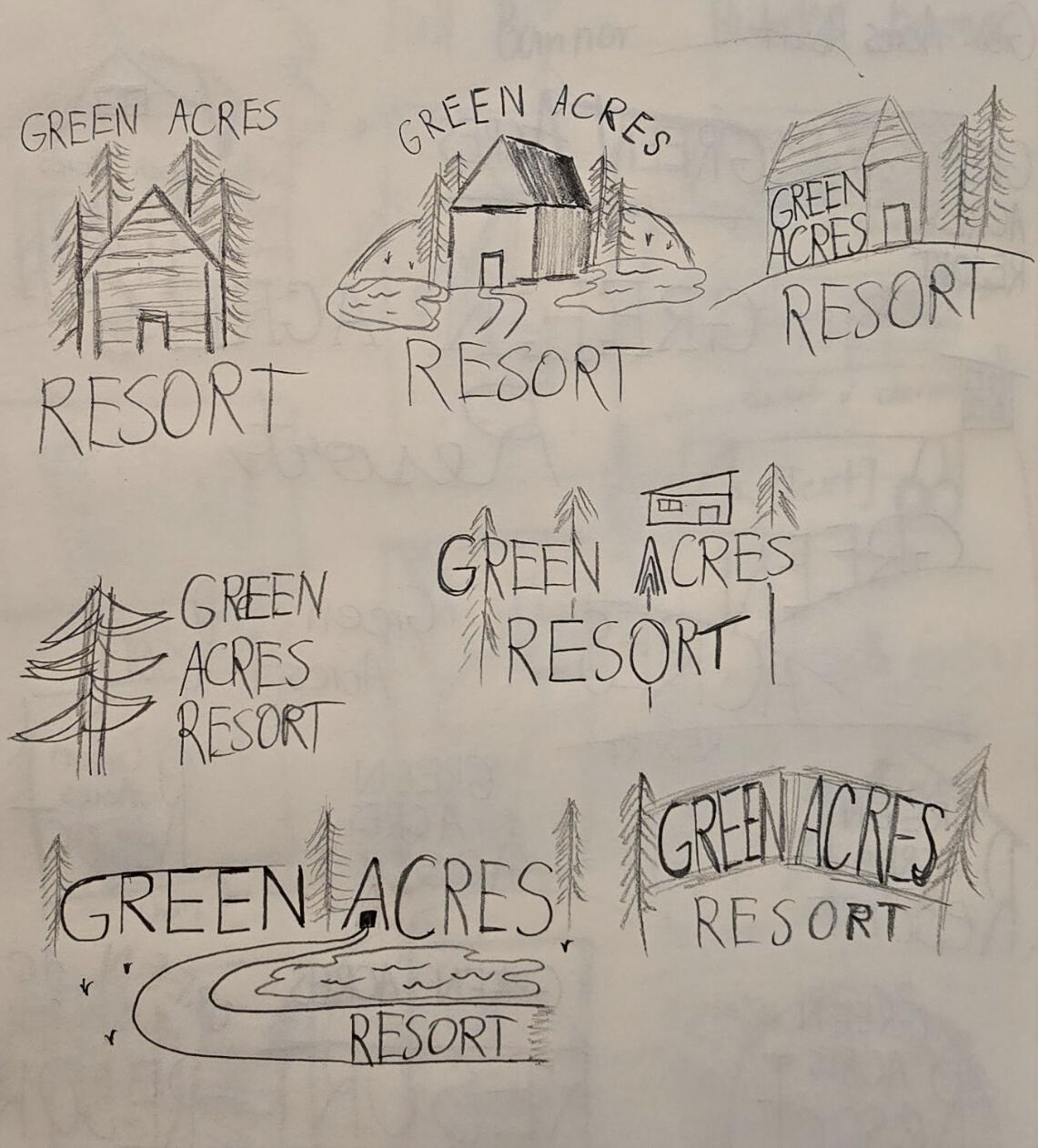
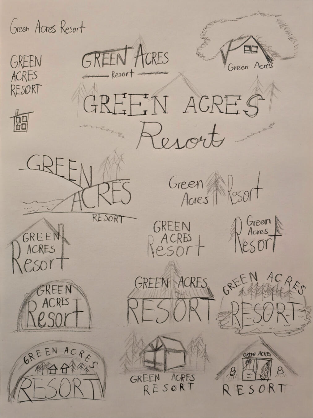
Some drafts I have made coming up with different logo designs. All of these show a direction I wanted to take with the resort.
Project's Approach
I approached this project with two simple goals in mind. Improving their logo and bringing in consistency throughout their branding.I was able to establish a solid grounding point for inspiring my design. I had to find out the general sense of who they are catering to and what accommodations they offered.
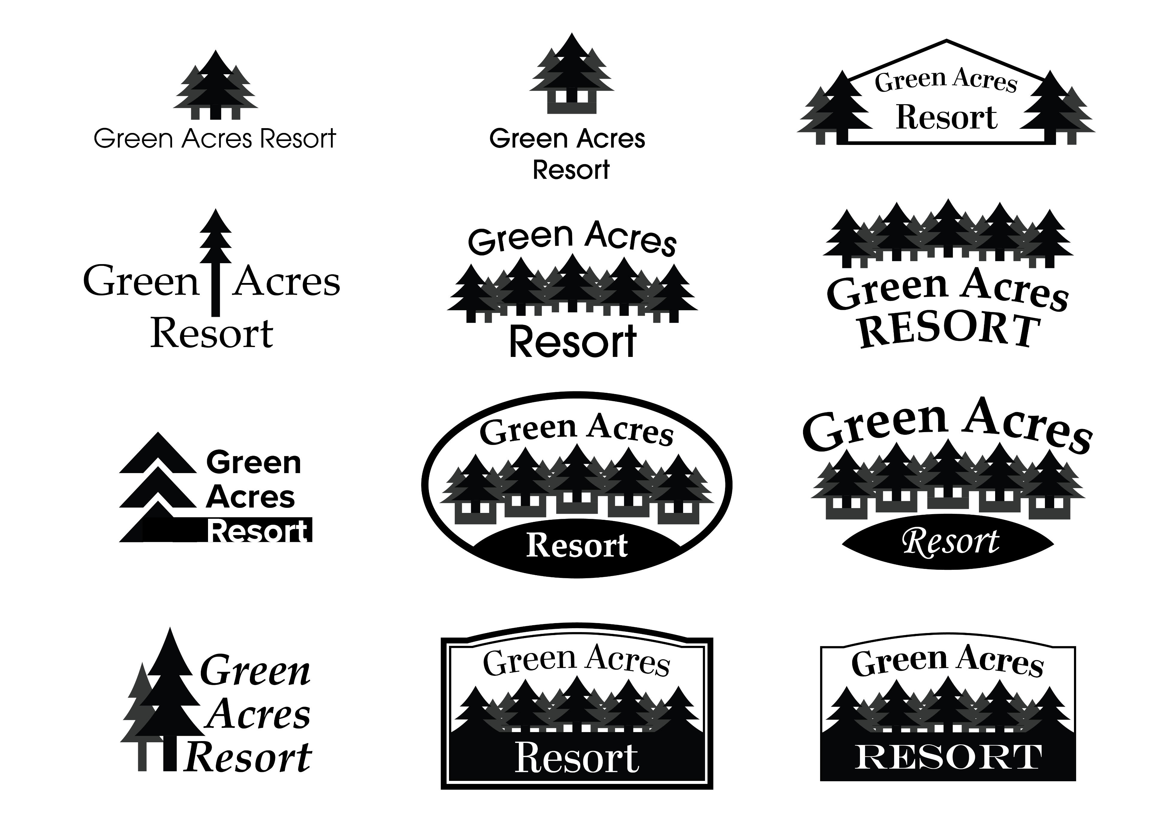
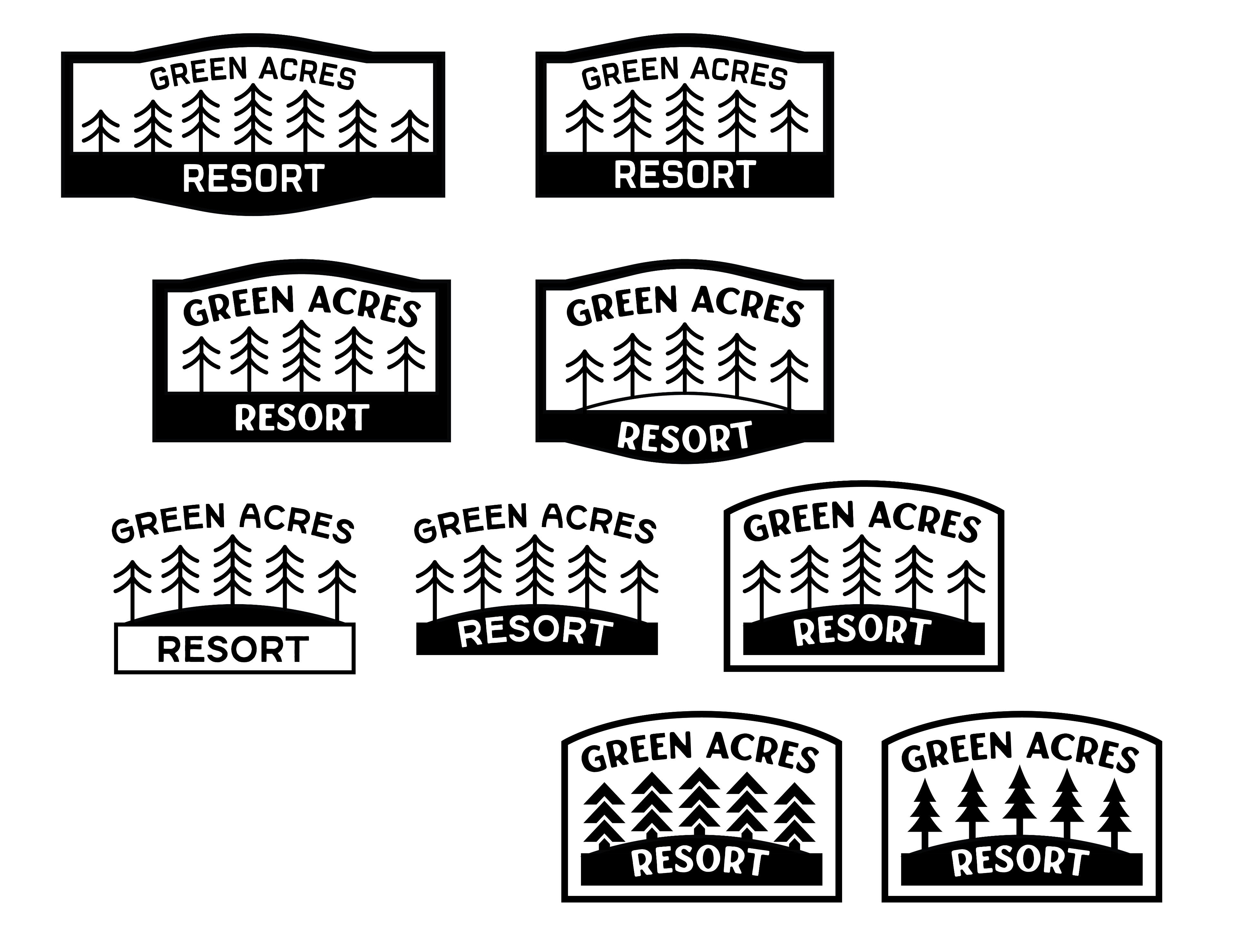
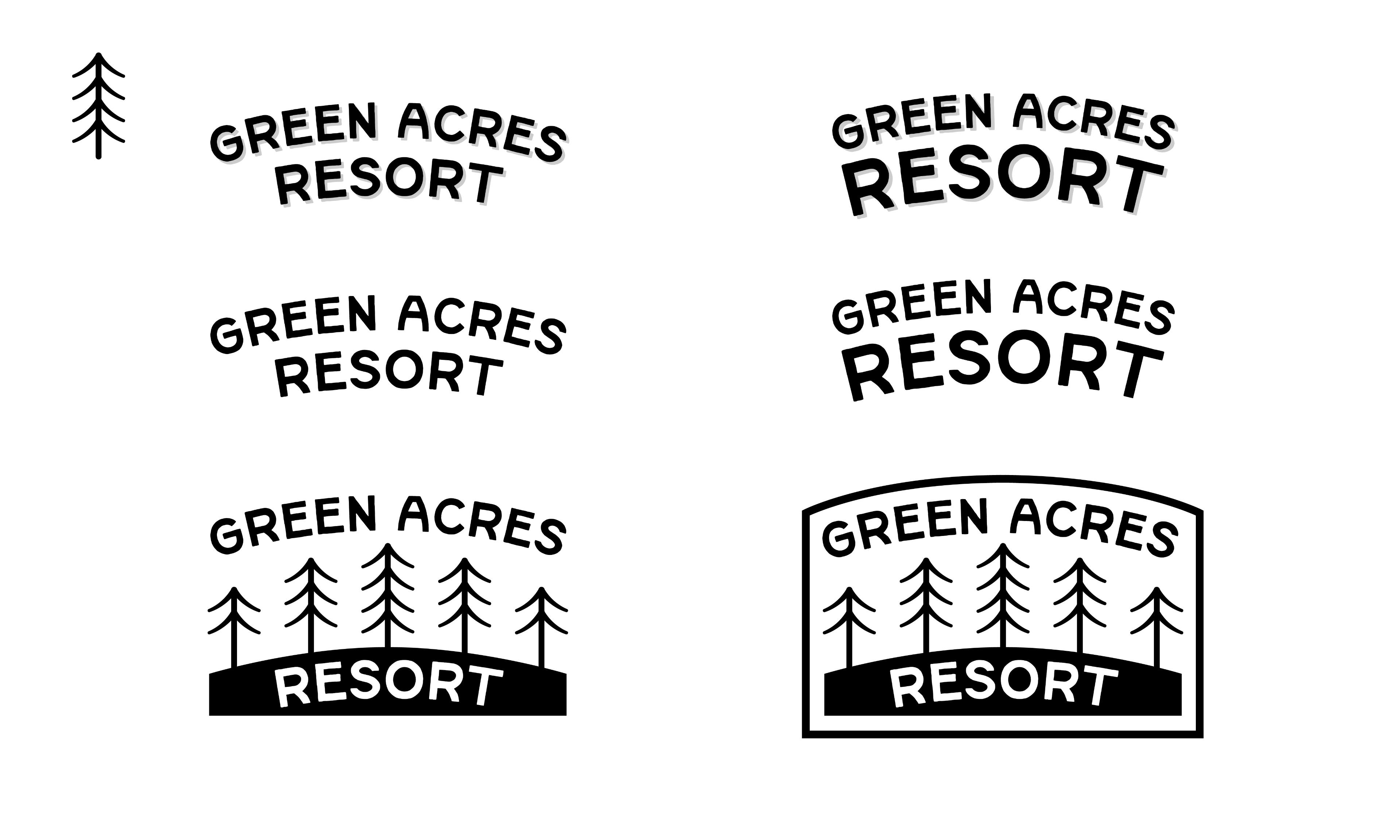
Some digital sketches I have made throughout this project. You can see how my previous ideations shift from each phase where the typeface could be different, overall layout/placement and positioning of various trees.
The Eventual Solution
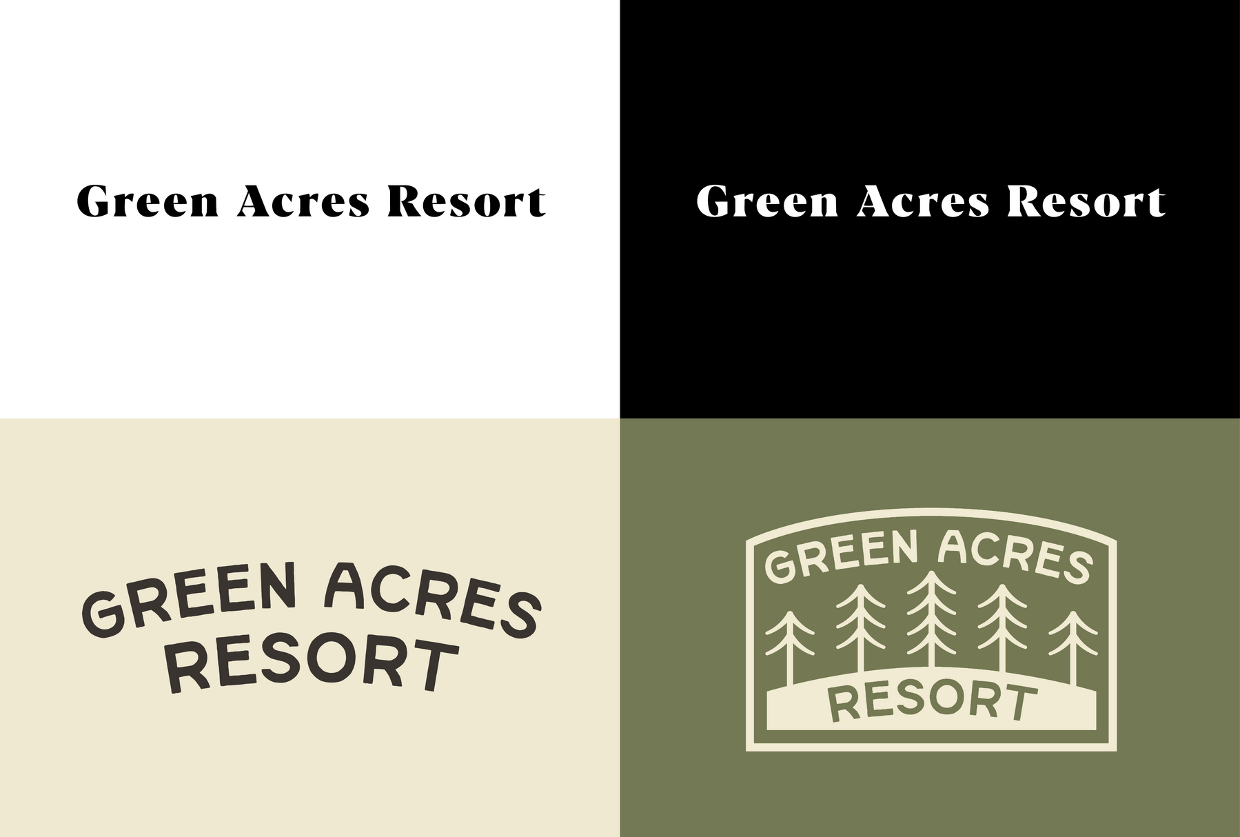
I produced a logo that had bright forestry colours reflecting their scenery, incorporating trees that were inspired by their signage and the surrounding area of Salt Spring Island, and decided on using an outdoors-styled typeface to home in what style their accommodations are like.
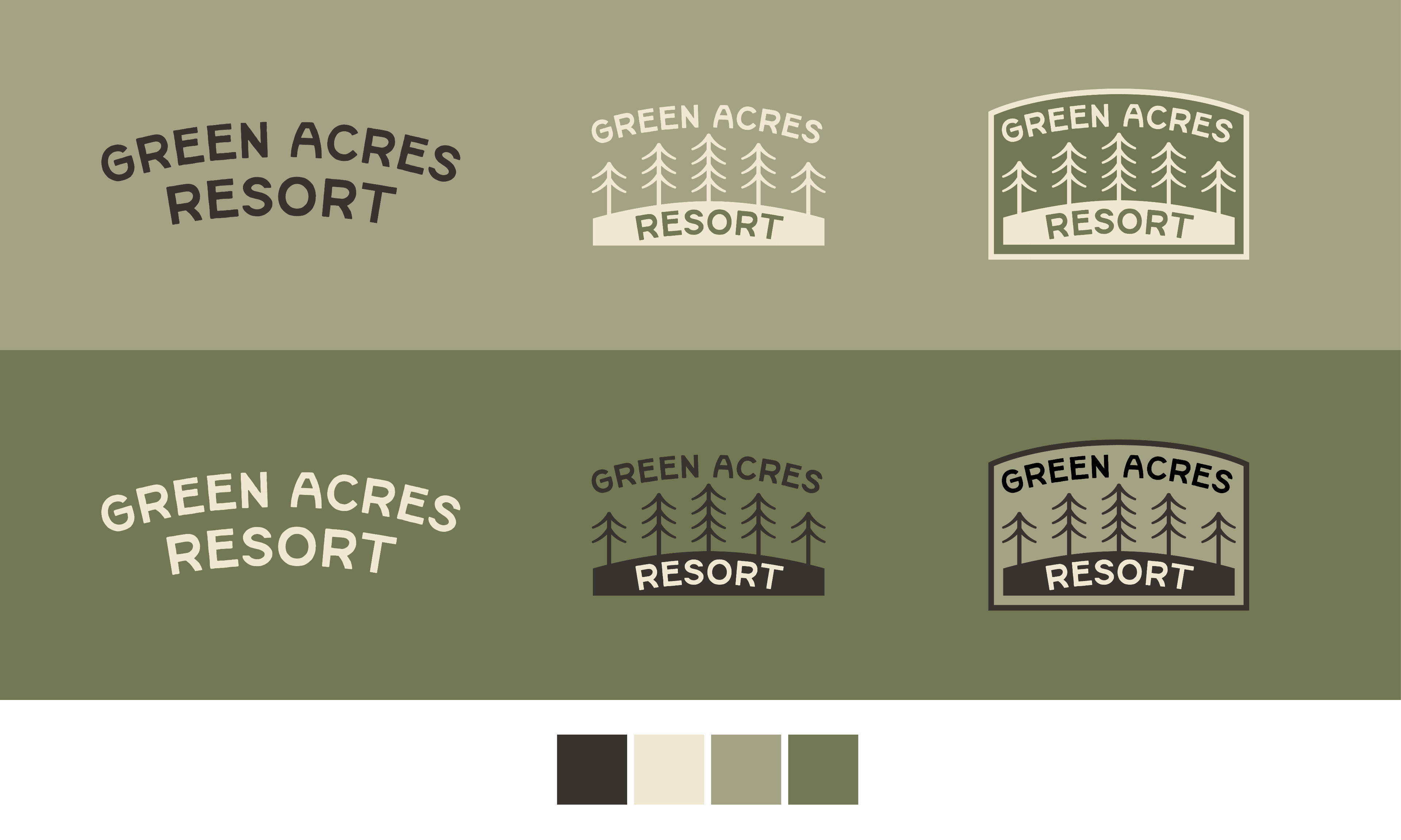
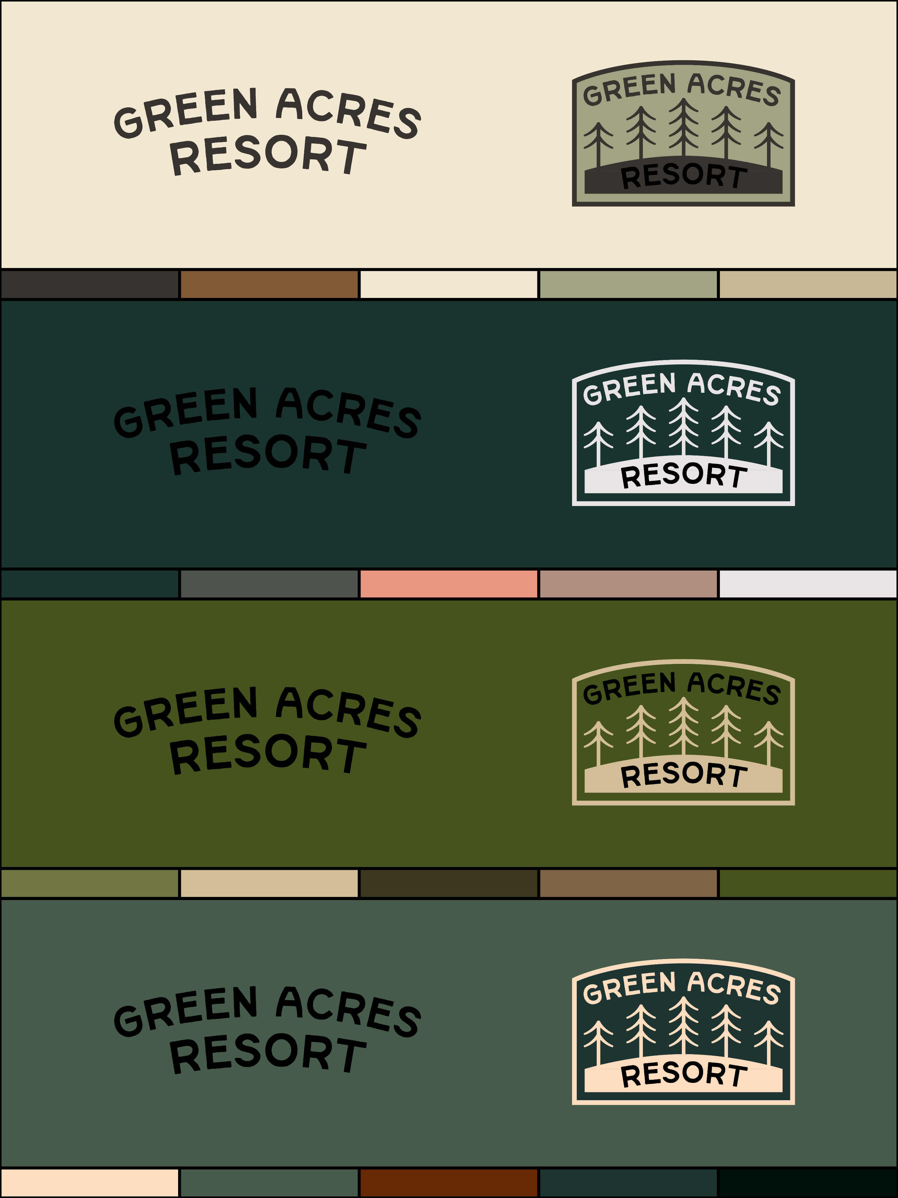
This was testing out different colour palettes. Trying to figure out a palette that meant to be taken from the Pacific Northwest was more challenging than I initially expected.
Potential Mockups
To show evidence that the rebrand can stay consistent, I moved on to the second phase where I used mock-ups on potential materials to see what Green Acres Resort could offer. I started with the typical things you’d normally find in a resort such as stationery, door hangers, decorative pins, etc. Other fun mock-ups I done are fridge magnets and cassette tapes.
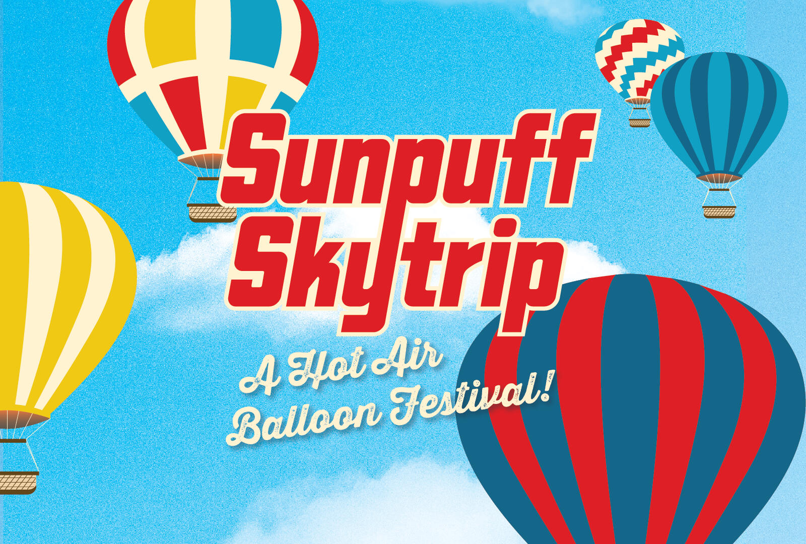
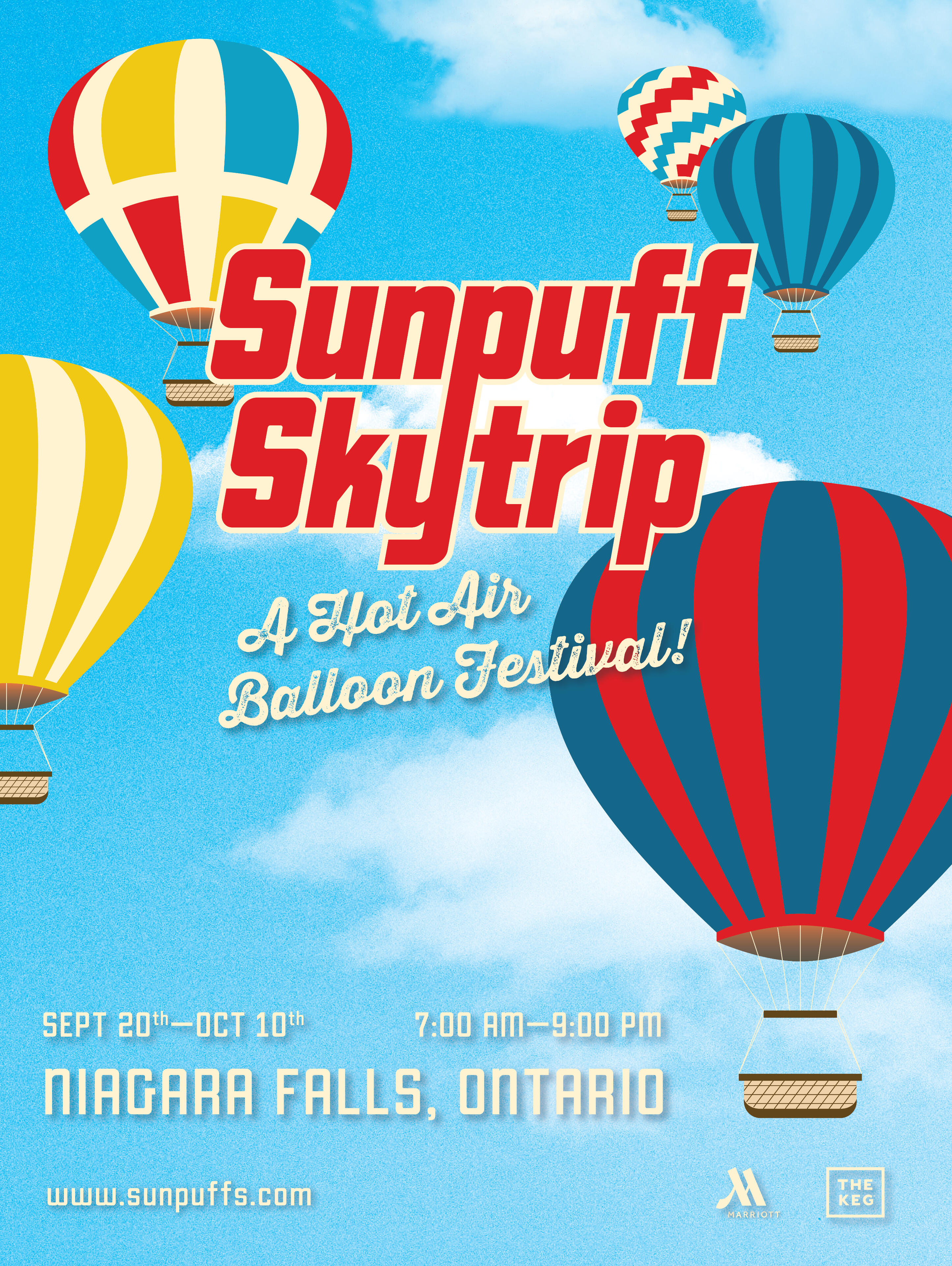
Sunpuff Skytrip
This project discusses how I turned an idea into an event poster with the client providing me the information and won’t see the finalized result until the end.
Challenges I Faced
The challenge was to create an event poster that our client commissioned us to do. The client gives the designer the information on what they want and how they visually want it to be. Me, as the designer, must interpret their information into a visual piece without their feedback until the final.
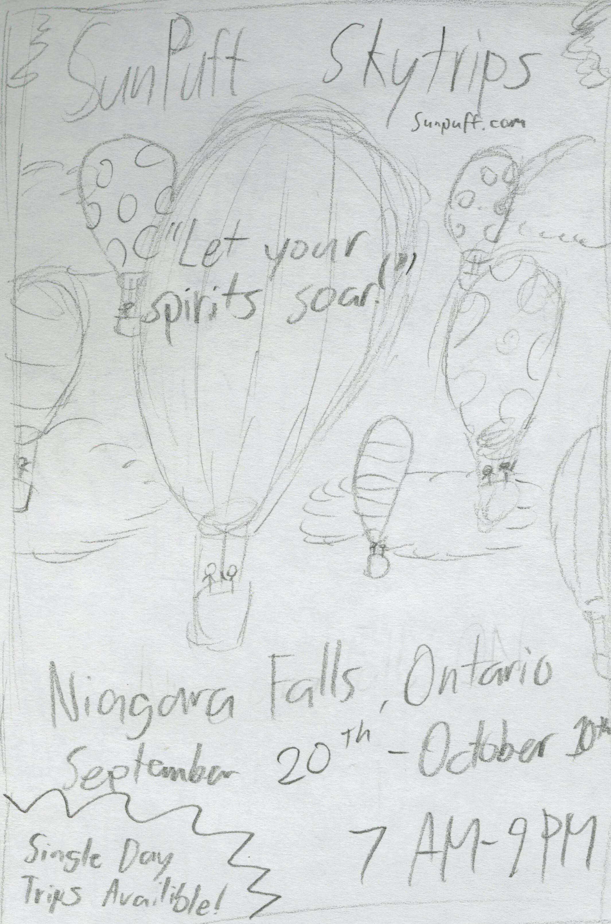
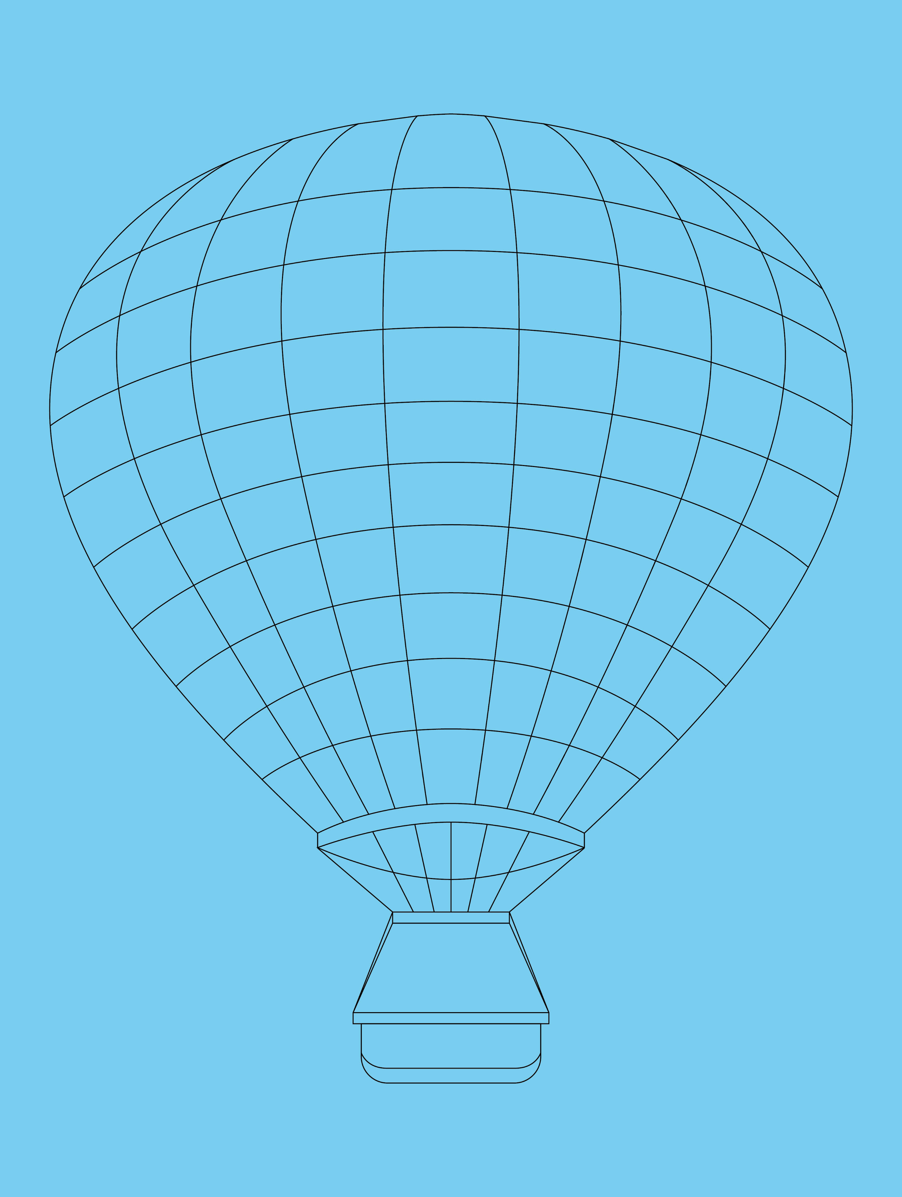
Some concept sketches I have made showing a variety of placement of information and different hot air balloon styles.
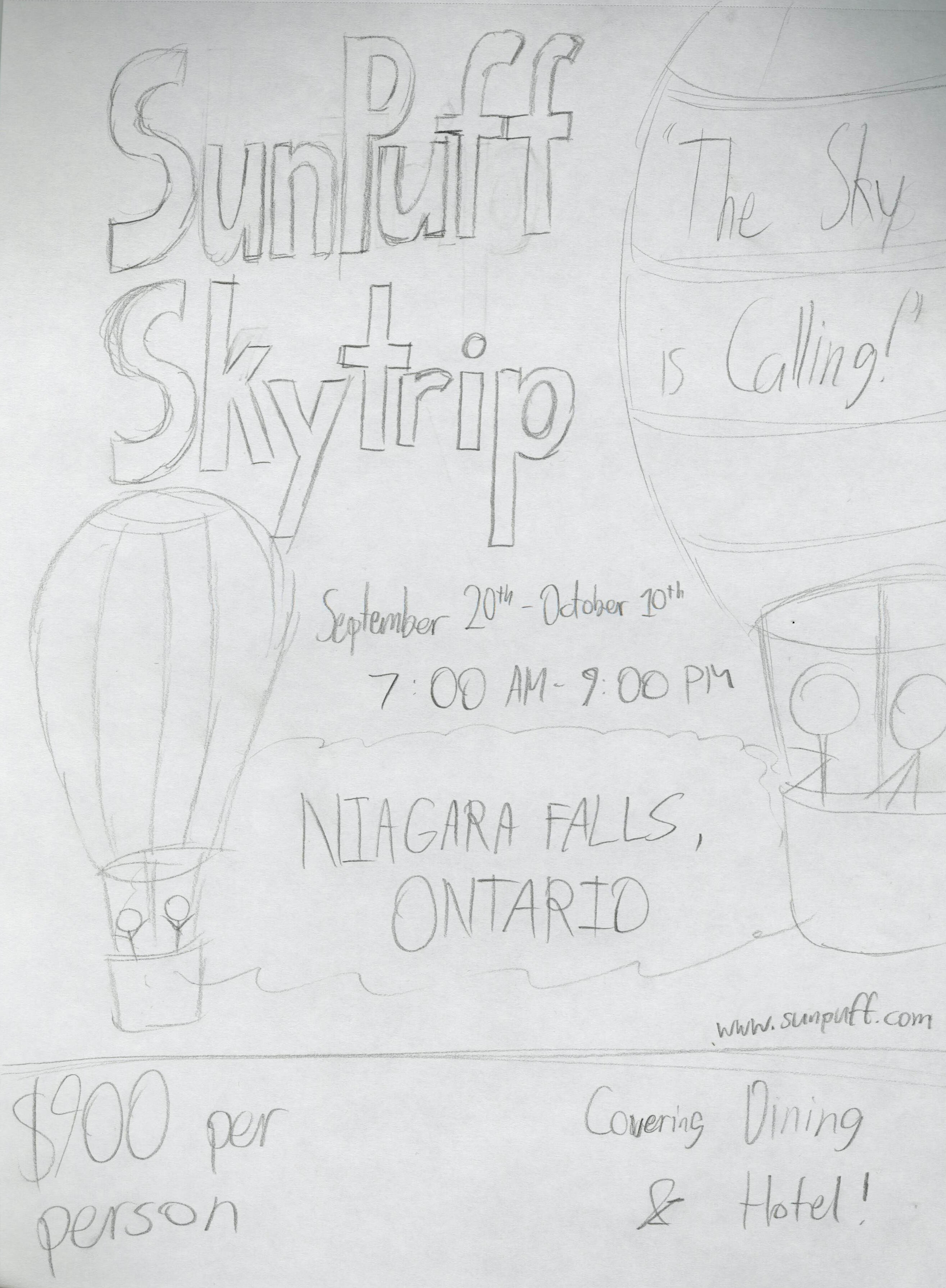
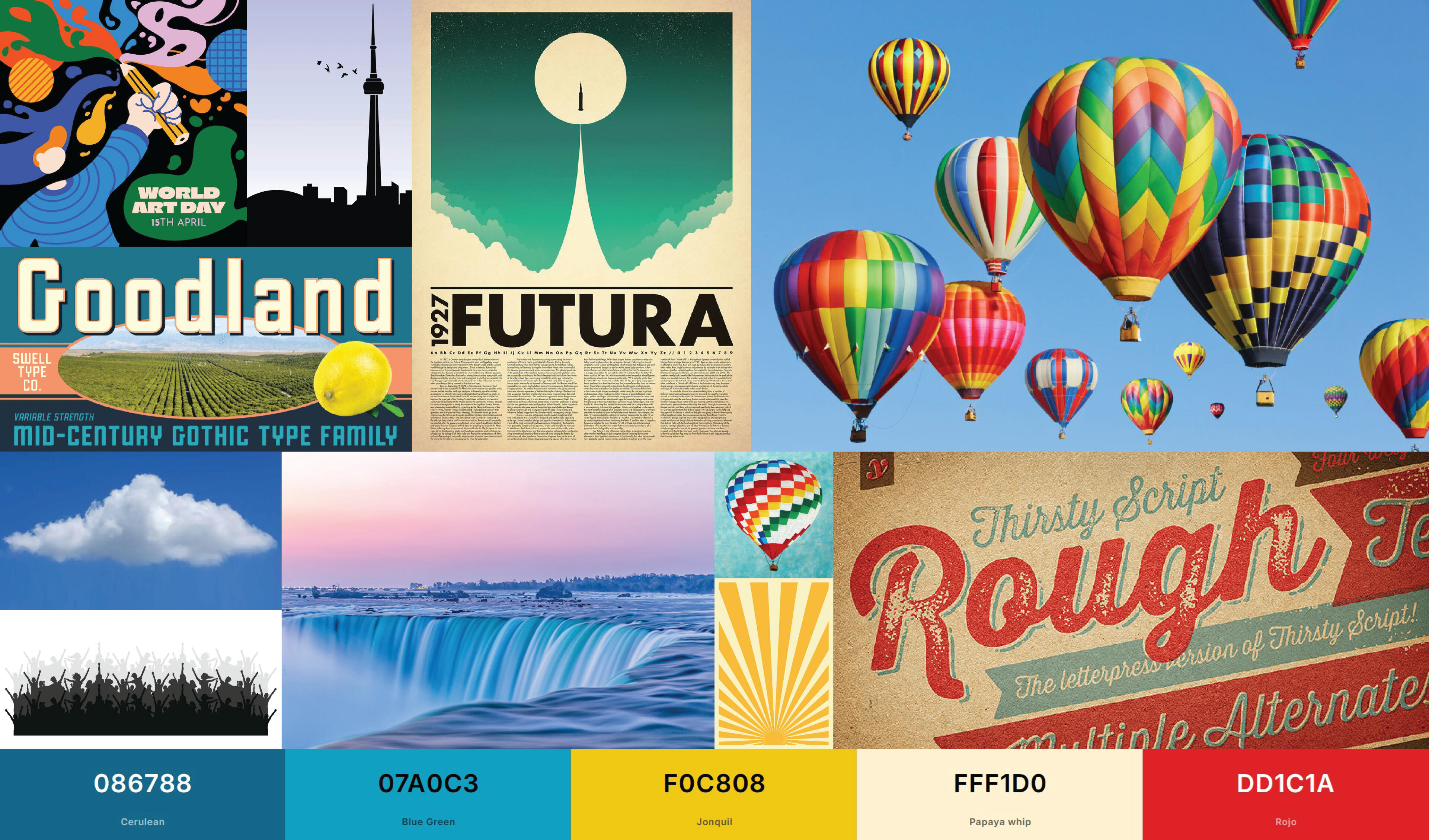
This is my moodboard showcasing the various ideations I want to get inspiration on. A hot air balloon poster design usually features illustrations, bold typeface, and a bright colour palette.
Project's Approach
The client wanted to commission me to do a hot air balloon festival poster, he gave me the information that was mandatory for an event poster and wanted me to include two sponsors since this it’ll be an expensive event to run.The client wanted the location to be at Niagara Falls, Ontario, which did sound interesting and would be an impressive remarkable sight. I started to research on what would be the two main sponsors around the Niagara Falls area that can suit the client’s need for dining and hotel. After learning the geographic layout of the Niagara Falls area, I came across ‘The Keg’ for dining and ‘Marriott’ for hotel.
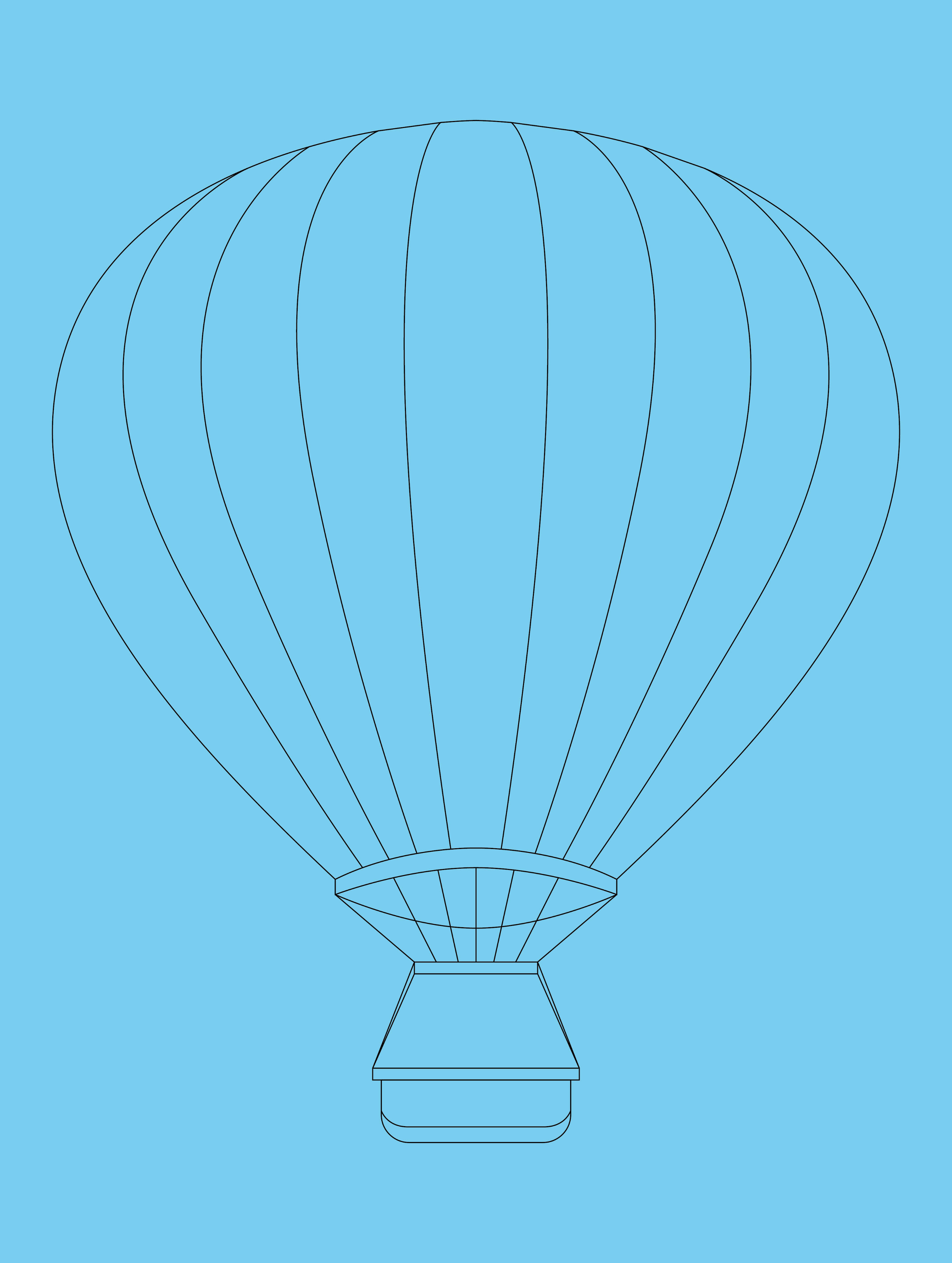
In order to make the hot air balloons customizable, these were illustrated and made it paint-able where each stripe can be made a different colour for variety.
This allowed me to have a large variety of hot air balloons design that can be done with the restrictive colour palette I have given myself.
The Eventual Solution
Multiple hot air balloons were needed to fill in a dense background, and I decided on making hot air balloons illustrated. Colours are quite bright and vivid as to stand out and best contrasts the other hot air balloons that will be hovering around.An atmospheric background element is shown to express the freedom of riding inside a hot air balloon. The typeface is edited, custom-designed and large to see from a distance. The text is also minimal and only shows the necessary information on the poster.Overall, the client is satisfied with the poster as it hits the requirements on what he envisioned it to be and even proclaimed it to be better than he expected. The best highlight was particularly the client’s satisfaction on the main logo ‘Sunpuff Skytrips.’ It fits the theme of a fun and enjoyable experience.
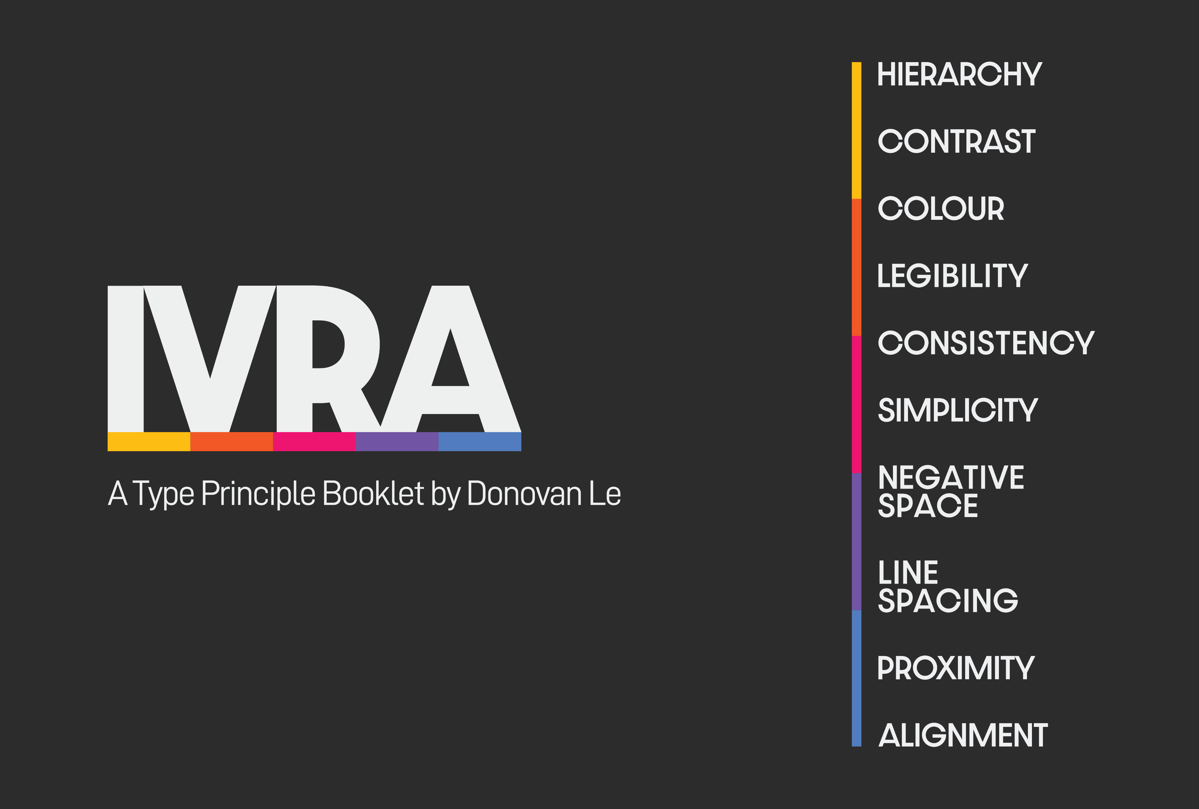
Type Principle Booklet
This project shows how I discussed the 10 most important part of typographic rules in a booklet. While the eventual outcome was a physical booklet, I also achieved on creating a new brand for myself that I'll take with me throughout my career.
Challenges I Faced
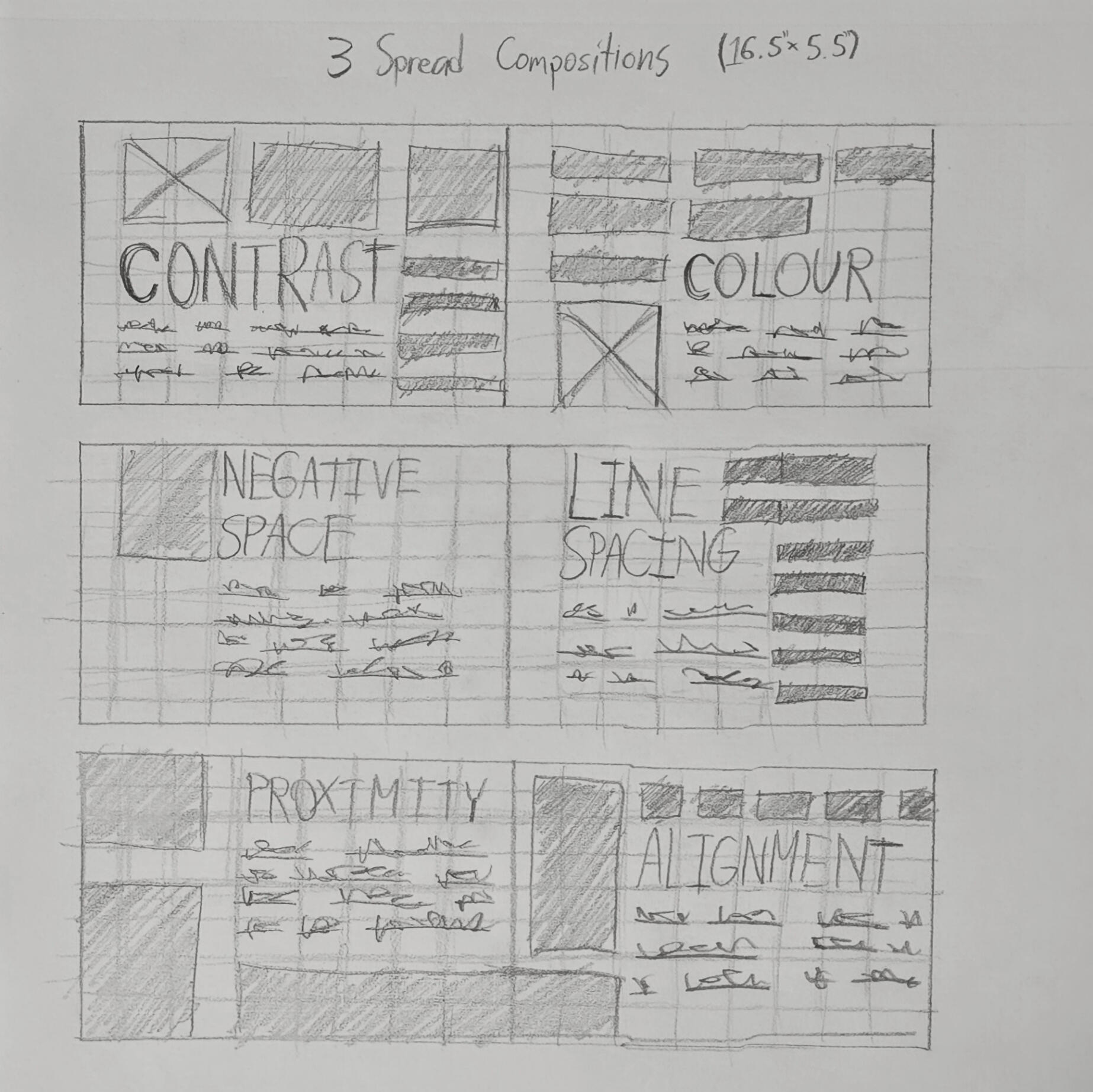
The challenge I had when starting the development of this booklet was finding the design direction I wanted to go for. My concept thumbs follow the final design outcome with big headings and rectangular shapes. The flat plan and spread compositions followed something similar with refining the arrangement of type principles and design layout.
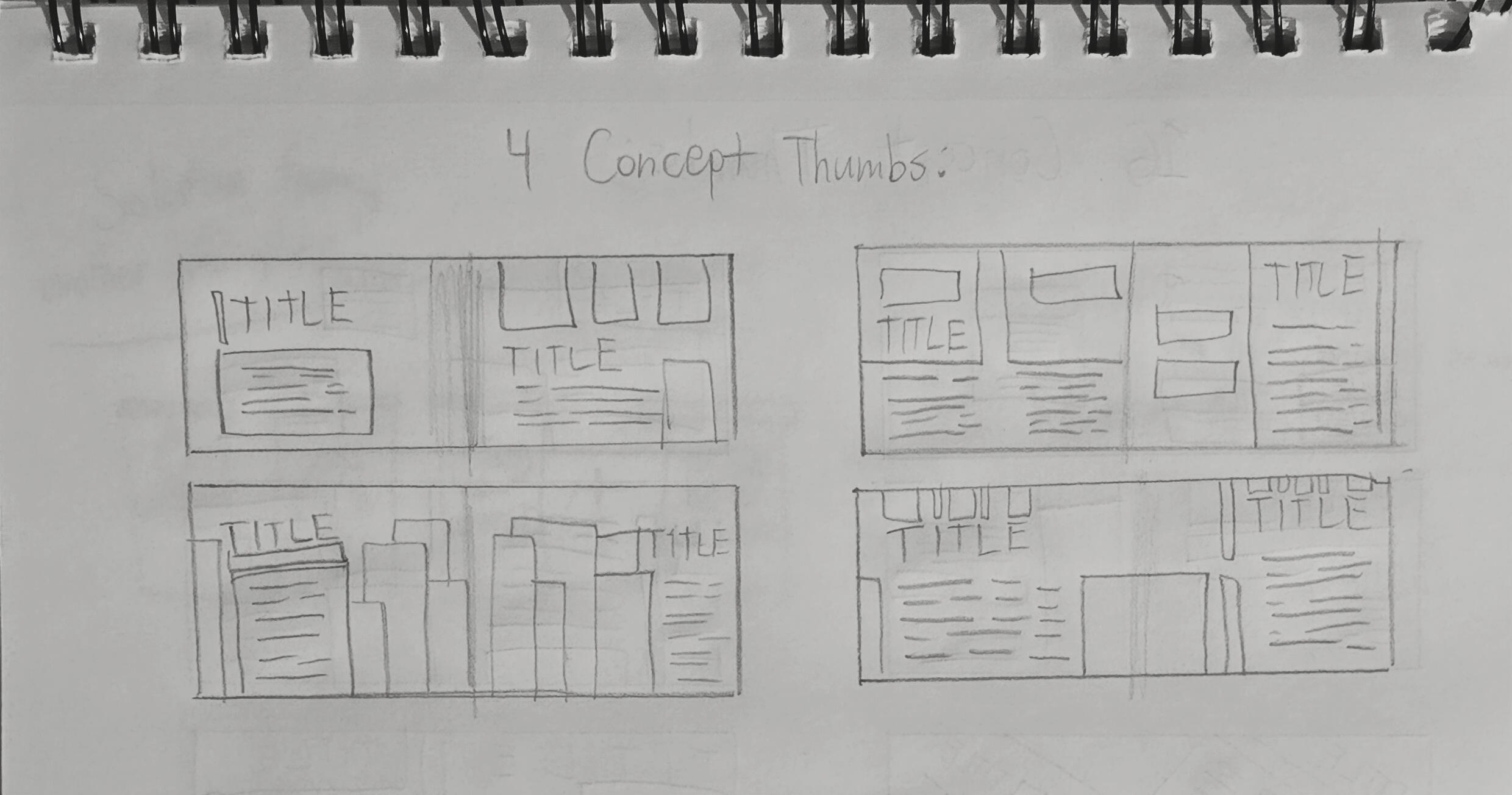
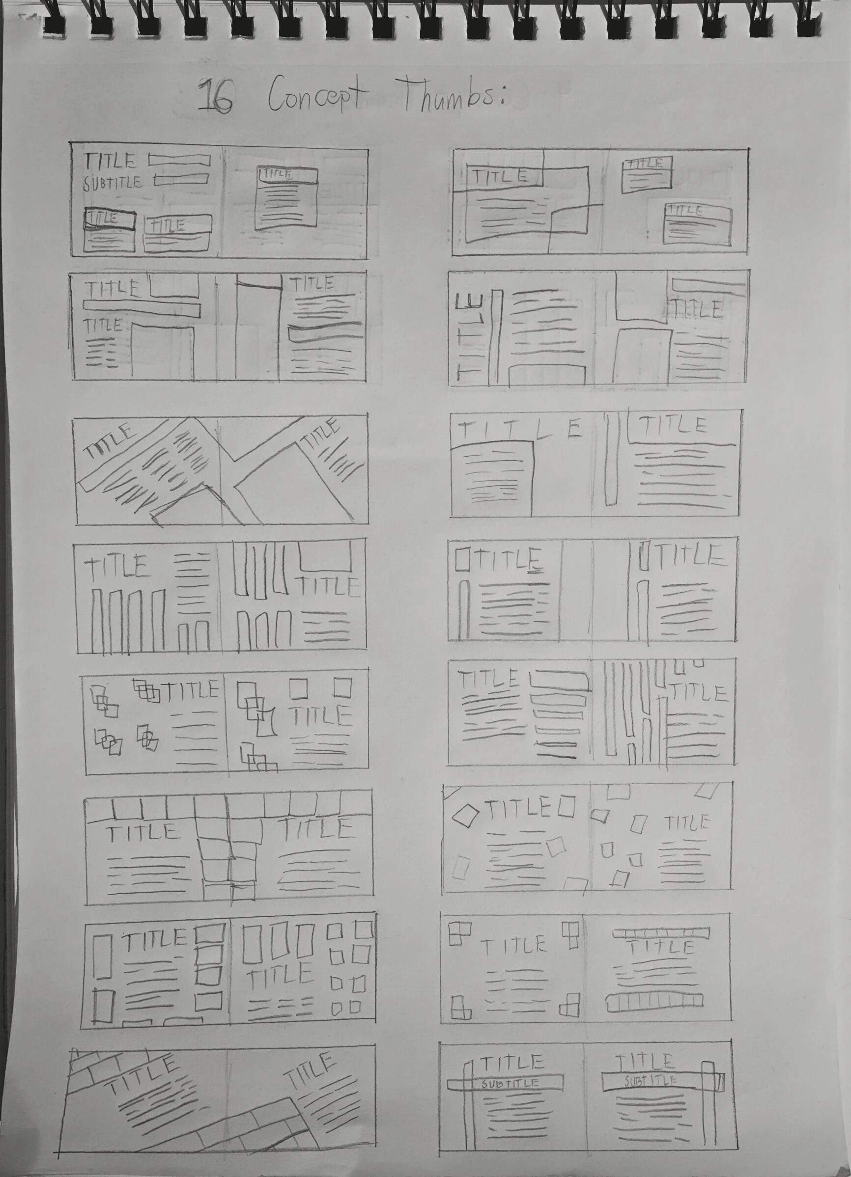
Initial concept sketches I had developed showing the process on how I wanted to layout the booklet.Taking the three best sketches I had made, I refined those into a more clarified ideation on layout types.
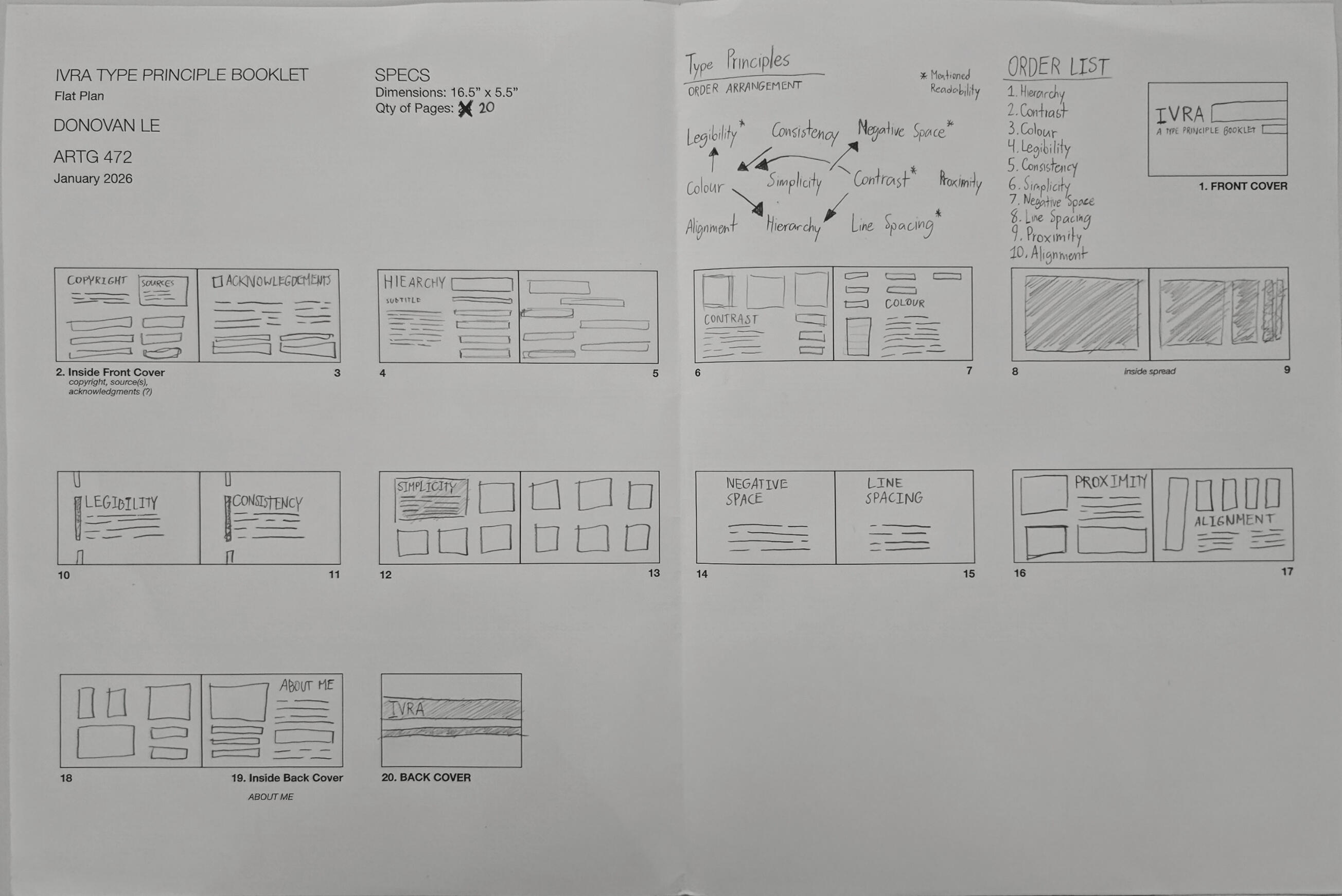
The flat-plan that was developed once I figured out the layout of the digital booklet and the order of the type principles.
Project's Approach
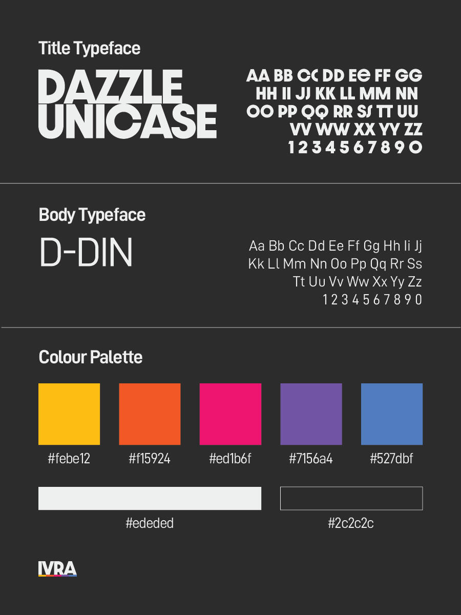
Initially, the typography booklet was very monochromatic and had rectangles like how I envisioned, but I felt like it needed bright colours to stand out. So I began to reformat the booklet into a dark background and search for a bright five colour palette that can work well in a dark background. I eventually figured out my grounding and format once I realized how this new palette can work out for me and began my progress into making this booklet the way I envisioned it.I had to make sure my grid setup had good spacing to accommodate design and text and having decently sized margins to fit markers/runners. After setting up the necessary paragraph styles, the typeface I wanted to use were going to be sans-serif, easy to read from afar, simple to navigate and a big family of type weights. The titles will use the font, “Dazzle Unicase’ and the body will use ‘D-DIN.’
The evolution that shows the before and after of the type principle booklet. You can see how I changed the colour palette to be in more high contrasting.
The Eventual Solution
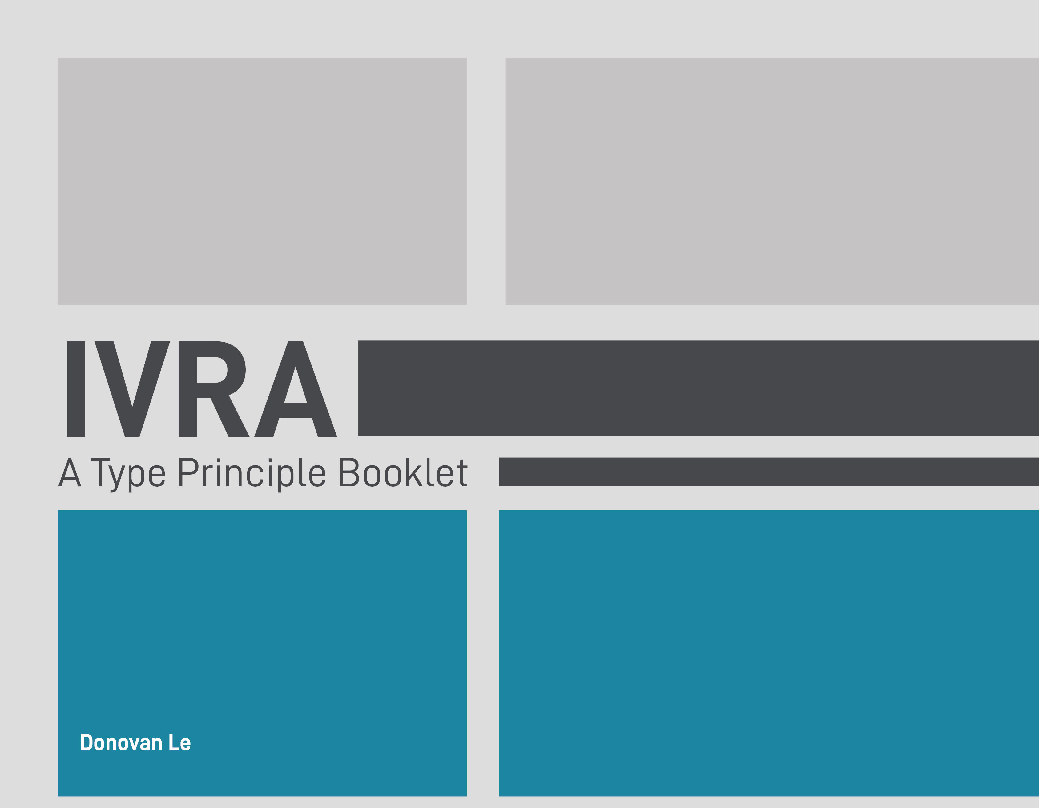
The results ended up being better than I expected. This is rarely a style I go for in previous projects, but something about a dark themed booklet with bright colours makes it seem visually cohesive. I had good feedback on the near-finalized booklet where white typeface needs more weight on dark backgrounds, refining kerning for large titles, remove automatic leading for paragraph styles, and adjusting paragraph spacing to maintain consistency throughout the booklet.However, the most important objective I achieved with this typography booklet was finding a branding that I can work and enjoy with and take with me after graduation. This booklet has created my new profound style of having four right angles as a design which I have nicknamed it, ‘IVRA.’
The Booklet
Here is a small preview of my type principle booklet featuring some of the spreads I've made on a mockup. If you wish to see the entire booklet, I have made a downloadable .pdf file that's available by clicking the link below!
Donny Deals
This project explores the research, design process, and the eventual outcome. This booklet outlines the timeline on how ‘Donny Deals’ came to fruition and what was the leading factor that led me working towards this project.
The Research
I was already aware that electronic waste was one of the larger contributors of environmental pollution and I discovered three literature reviews that were published last year. The topics that I reviewed were about the lifespan of smartphones, considering counter measures for planned obsolescence, and potential future e-waste management strategies.
To summarize the three topics from the literature reviews, here are the main takeaway points of what I learned and discovered. The lifespan of smartphones can theoretically exceed to at least five to ten years, how repair-ability of devices must be designed from the start with no afterthoughts and how does rapid technological changes and product obsolescence accelerate e-waste. These are all valid points, and they do support my reasoning for creating this project.
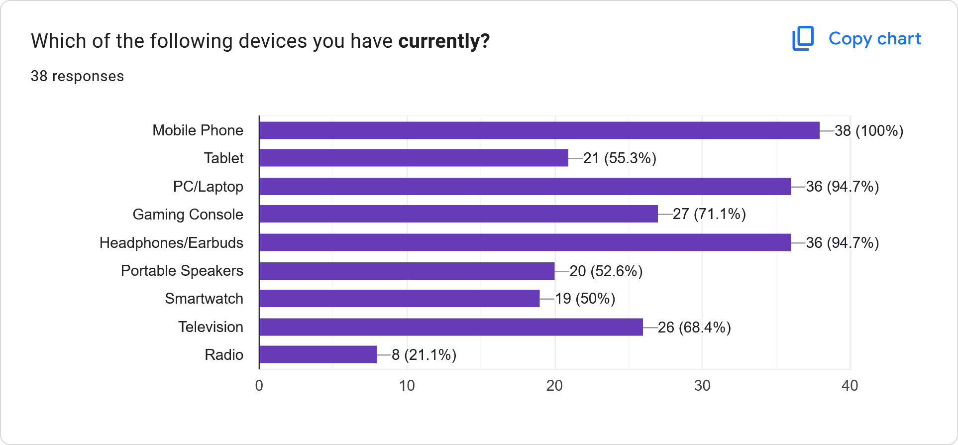
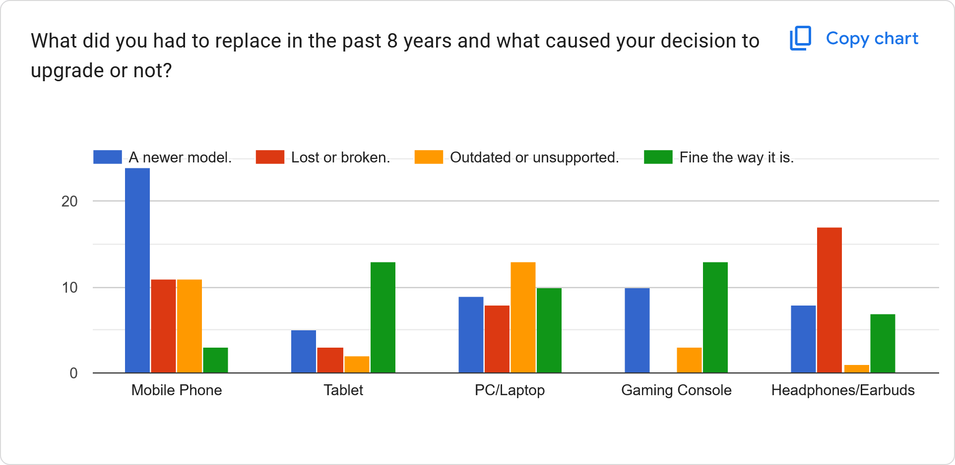
I conducted a survey where I asked people that I knew, to participate in my survey about their thoughts and perspectives on e-waste. I received a total of 38 responses, and most of the responses has shown that people having a mobile phone, PC/laptop, or headphones/earbuds usually ends up replacing due to purchasing a newer model or ended up lost/broken. They also pass down their outgoing device to a family member if they can.
Solution for Design
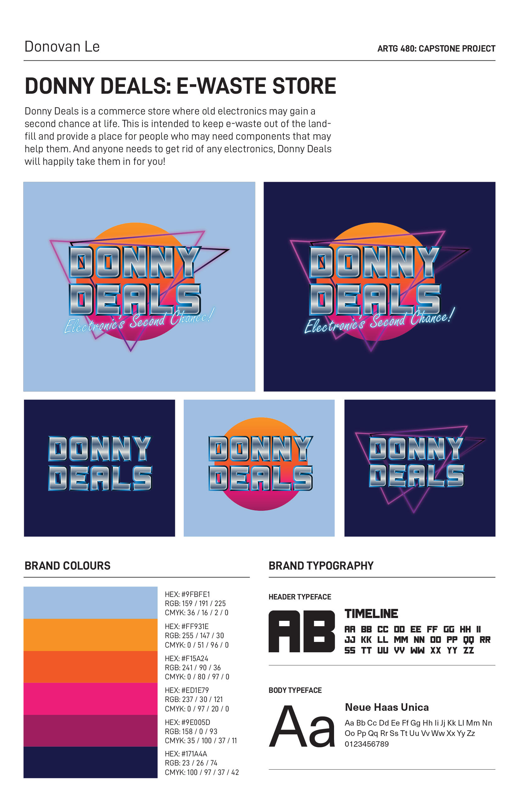
First step was to develop a name for this e-waste store. One name that stuck around was ‘Donny Deals’. Allegedly, it had something to do with my own name, Donovan, and my general interests of having old technology in my personal collection. I do like to talk about old technology at times where it gets to the point where I’m becoming a salesman, so I do believe this combination of factors does affect the final name decision.
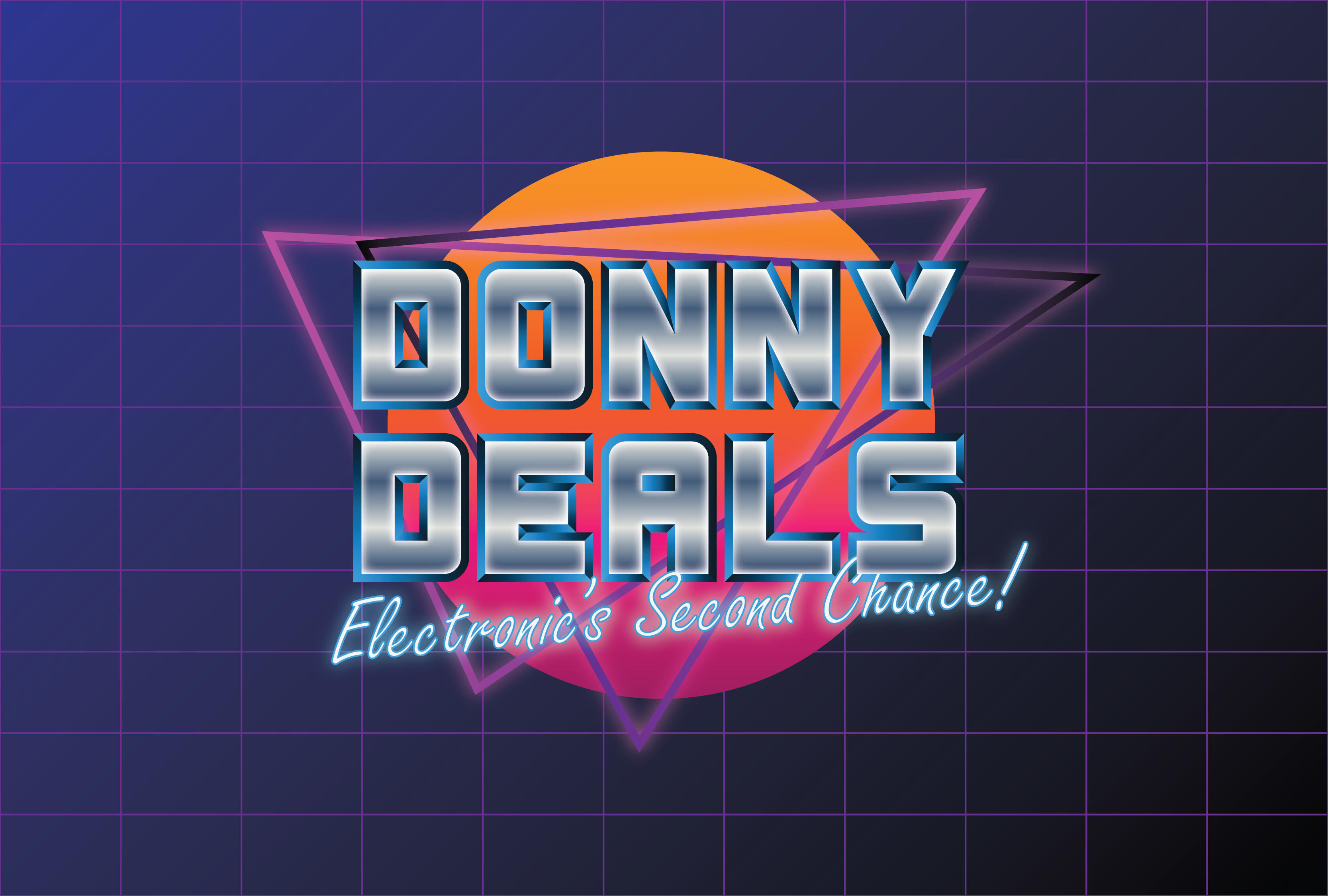
For the design, it was suggested that I would aim towards the “1980s Retrowave” styled look. Sporting a high contrast colour palette on a dark background, era-appropriate typeface and accurate effects, the design featured a gradient circle behind the text to mimic a sunset, typeface with a shiny metallic finish, and neon triangles in the background to go with the highlights of the lit-up slogan.
Here is the brand identity I put together for Donny Deals. Just from the aesthetic of the design, you can see that I was envisioning how legible the design on a dark and light background would be. That's what determined the decision to use mainly a dark background throughout the branding.
With the name and design in place, it was time to grab mock-ups for the identity and branding I built around this e-waste store. Some examples include stationary content, a loyalty card for returning/long-time customers, a mock-up of the storefront sign and overhead aisle, and additional extras such as downloadable wallpapers in various resolutions, USB flash drives, and a complimentary glass cleaner.
A preview showcasing some of the mockups.
Case Study Booklet
This project was the basis for my case study where I explored options on how to reduce e-waste being sent to the landfill. By creating a potentially real company who takes in e-waste and allows it to become recyclable, I have fulfilled that objective and that can be readable in my booklet I have developed!The case study booklet features more information and content than I can fit in my portfolio where you'll be able to read more about my research, the initial concept to final solution, various mockups, and a variety of designs spread throughout the booklet.
Package Redesign
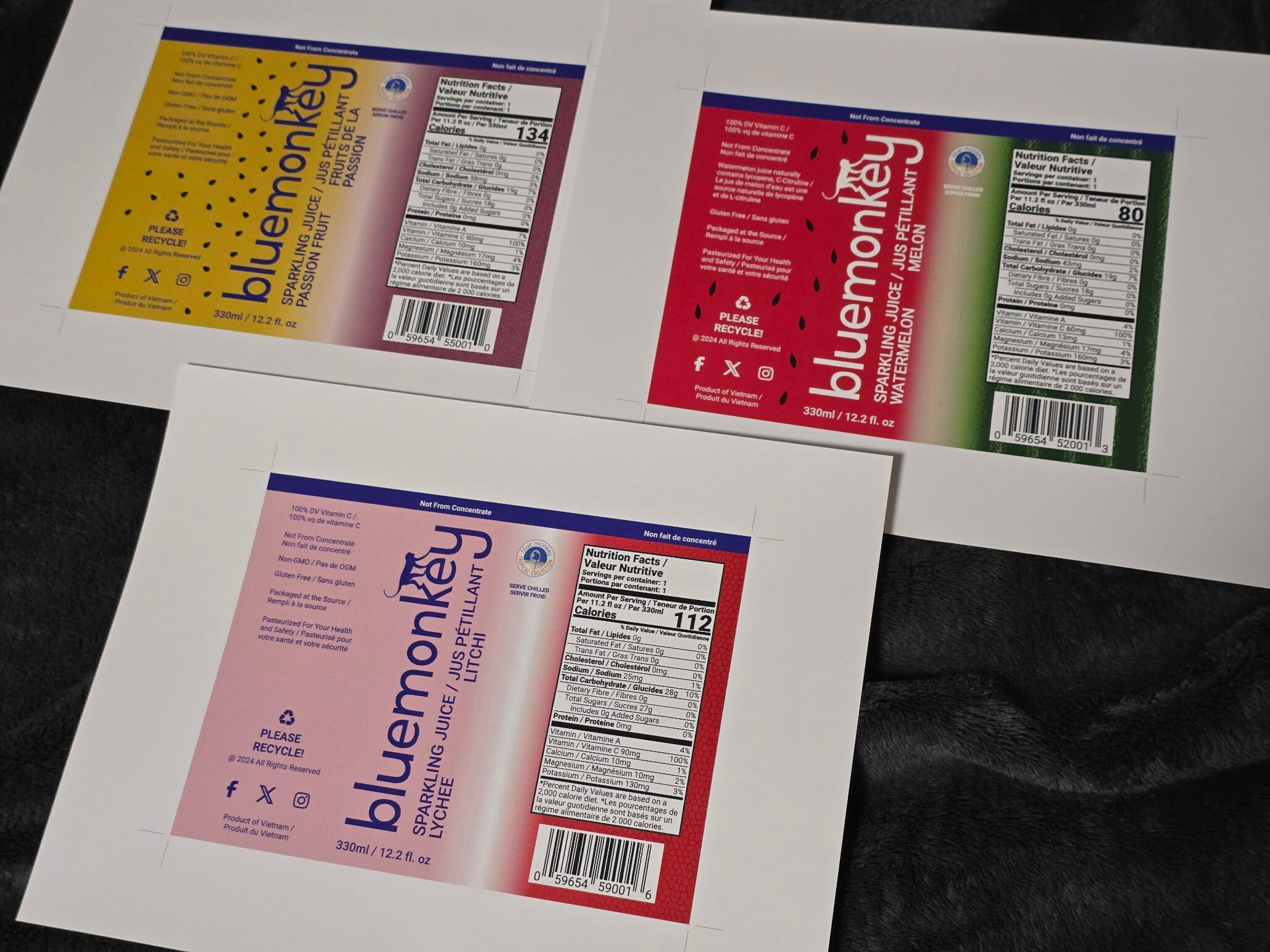
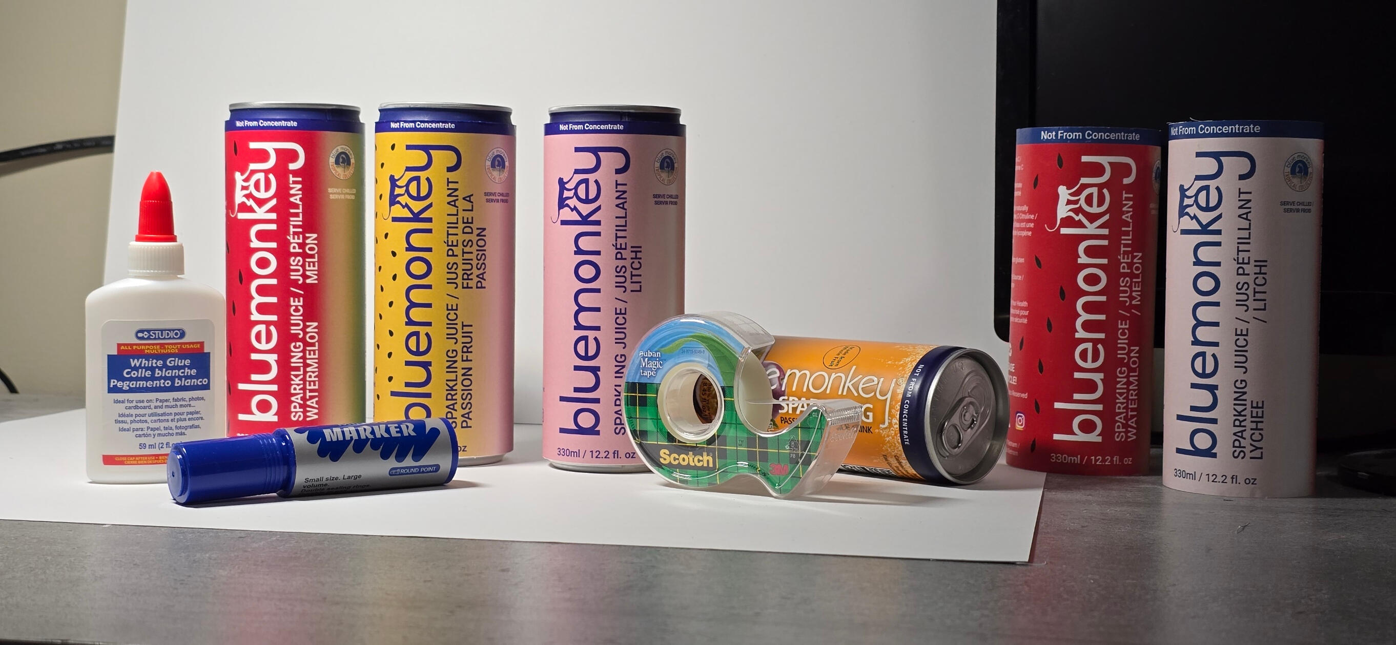
This project shows how I was able to take an existing packaging and revamp it into something more appealing to the market. Using beverages from Blue Monkey as my subject, I was able to create a design that's still in line with their brand identity and not take anything away from it.
Challenges I Faced
I wanted to keep true to the brand’s identify and try not to modify the packaging too much to the point of losing its branding. It still needs to be recognizable while being different at the same time. Keeping the same style and look while making changes to keep up with the times is certainly not an easy task as some may think.
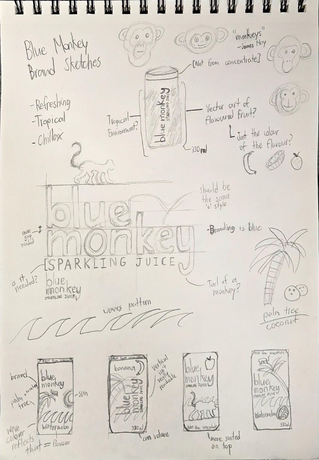
Here is the sketch page that I have filled with various notes and design ideas that could potentially be possible on a beverage can. Not only it has to be visible, but it needs to be identifiable to the brand.
Project's Approach
I took inspiration on inspecting other sparking juice beverages to see how their design stacks to Blue Monkey's current design.
The Blue Monkey packaging looks outdated compared to other sparkling juice beverages that are out on store shelves. By bringing it up to modern design, it should theoretically be able to catch up.
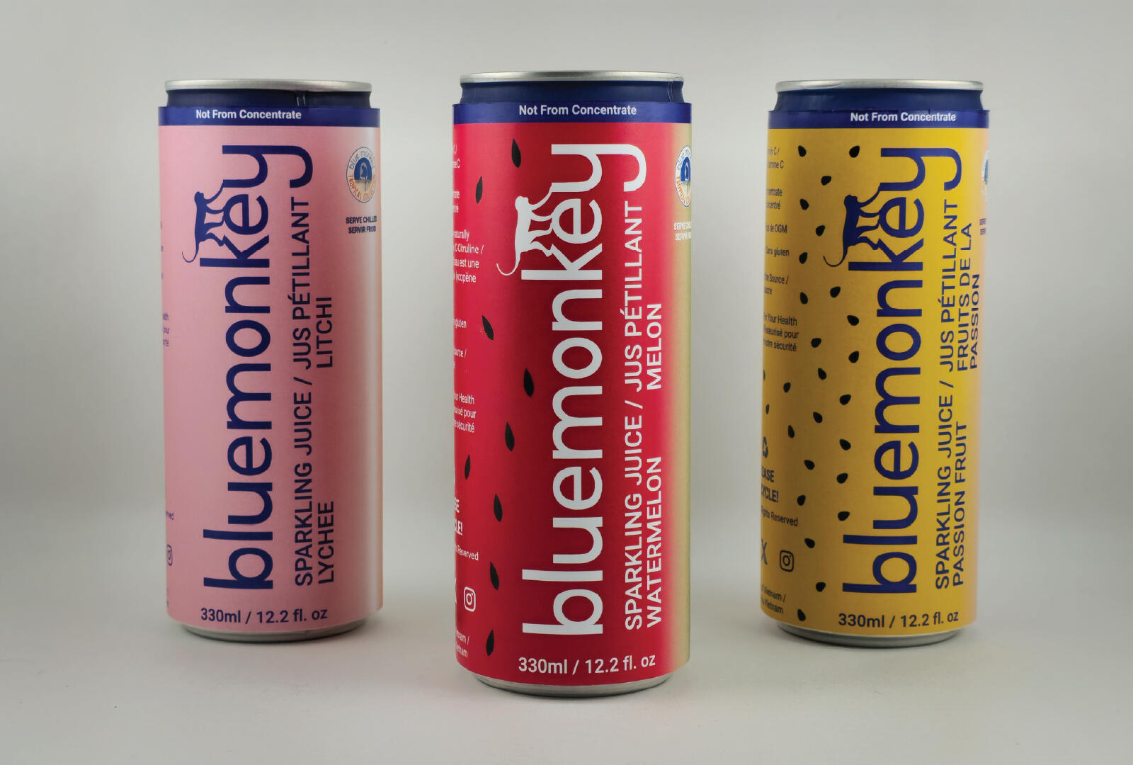
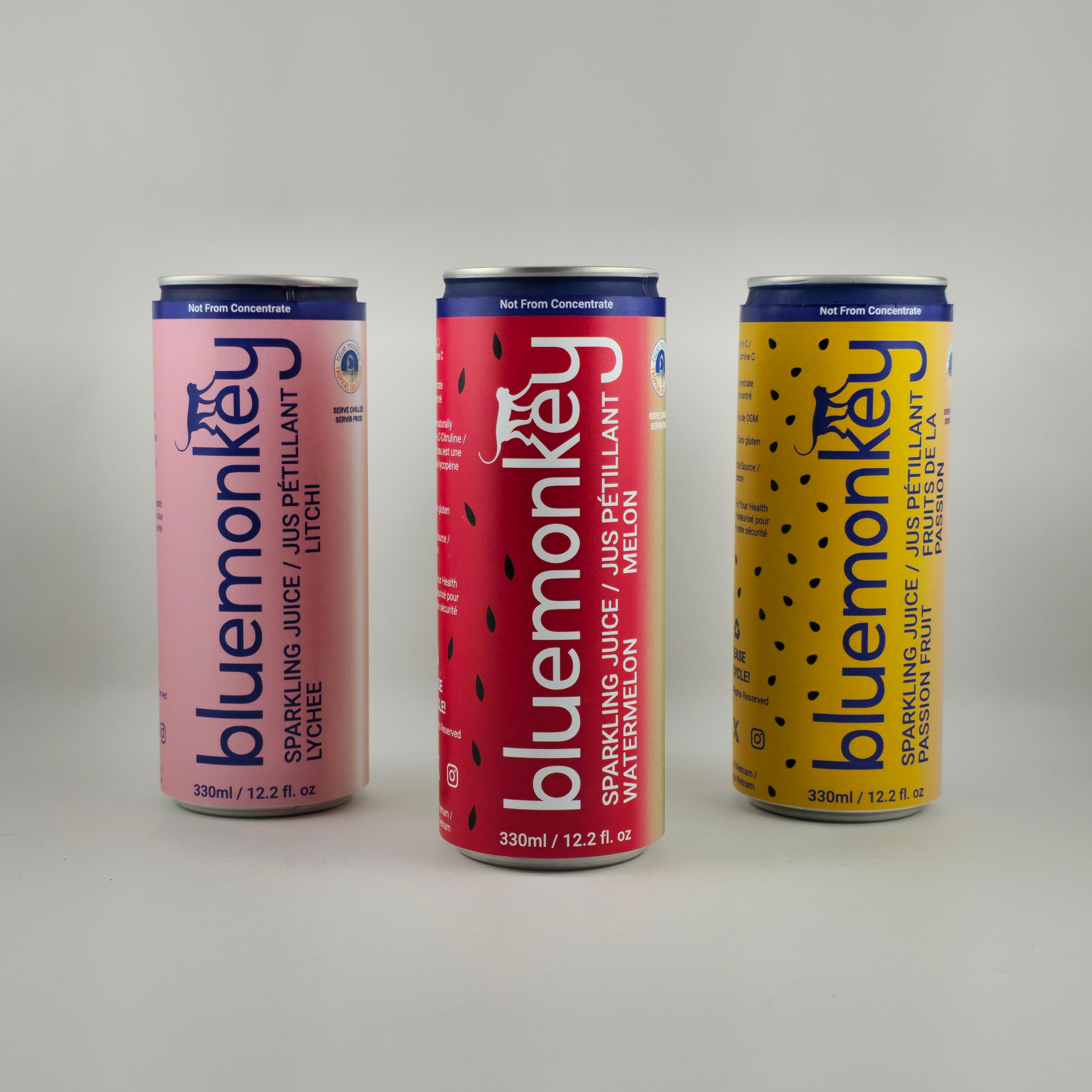
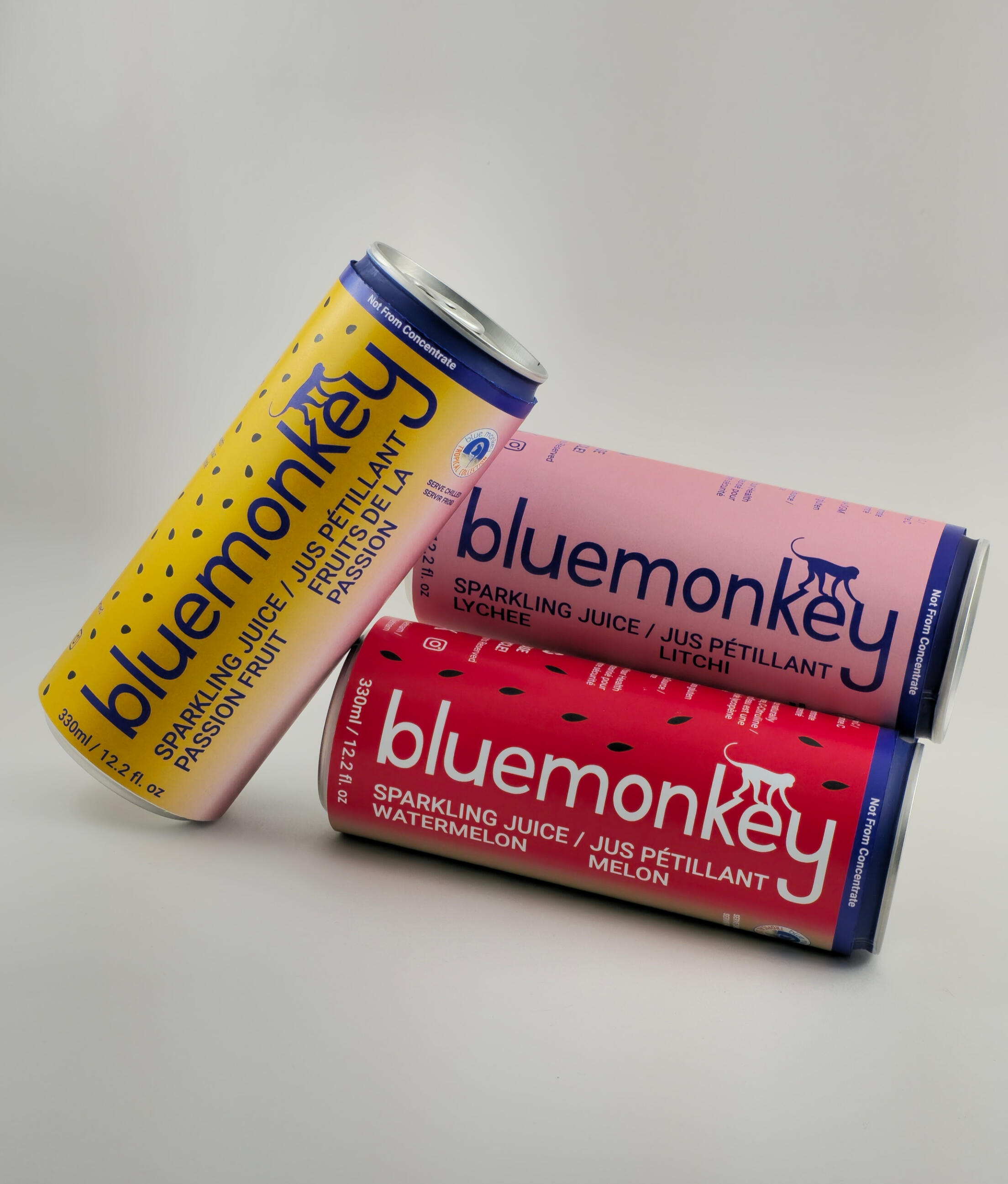
I took note of this when I redesign the cans, and followed a format that works interchangeably with different flavours. I went for this large simple art of the flavour that it represents. Each one has a texture, and a colour palette showing what fruit it is.
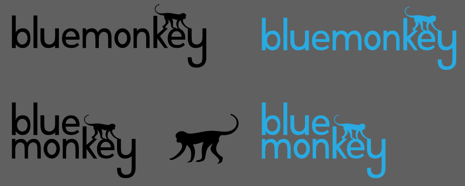
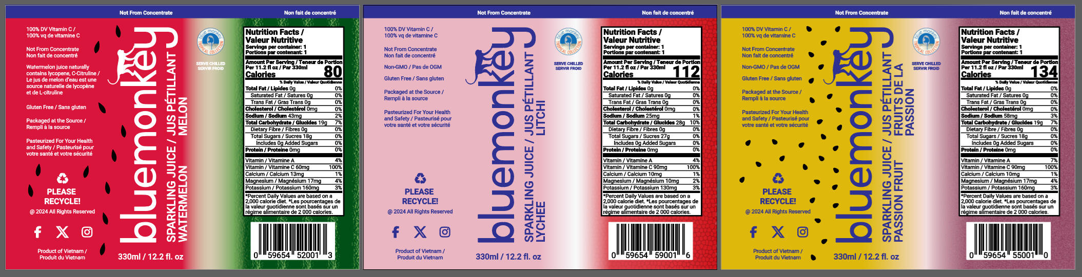
Redesigning of the logo by vectorizing and designing the new packaging for three flavours.
The Eventual Solution
Printing out the packaging, I had to ensure the length is long enough so that wrapping around the beverage can can be glued/taped together.The clean and bold redesign of the packaging should fit along side with the other sparking juice out there on the store shelves and still keep its charm of being recognizable among others.
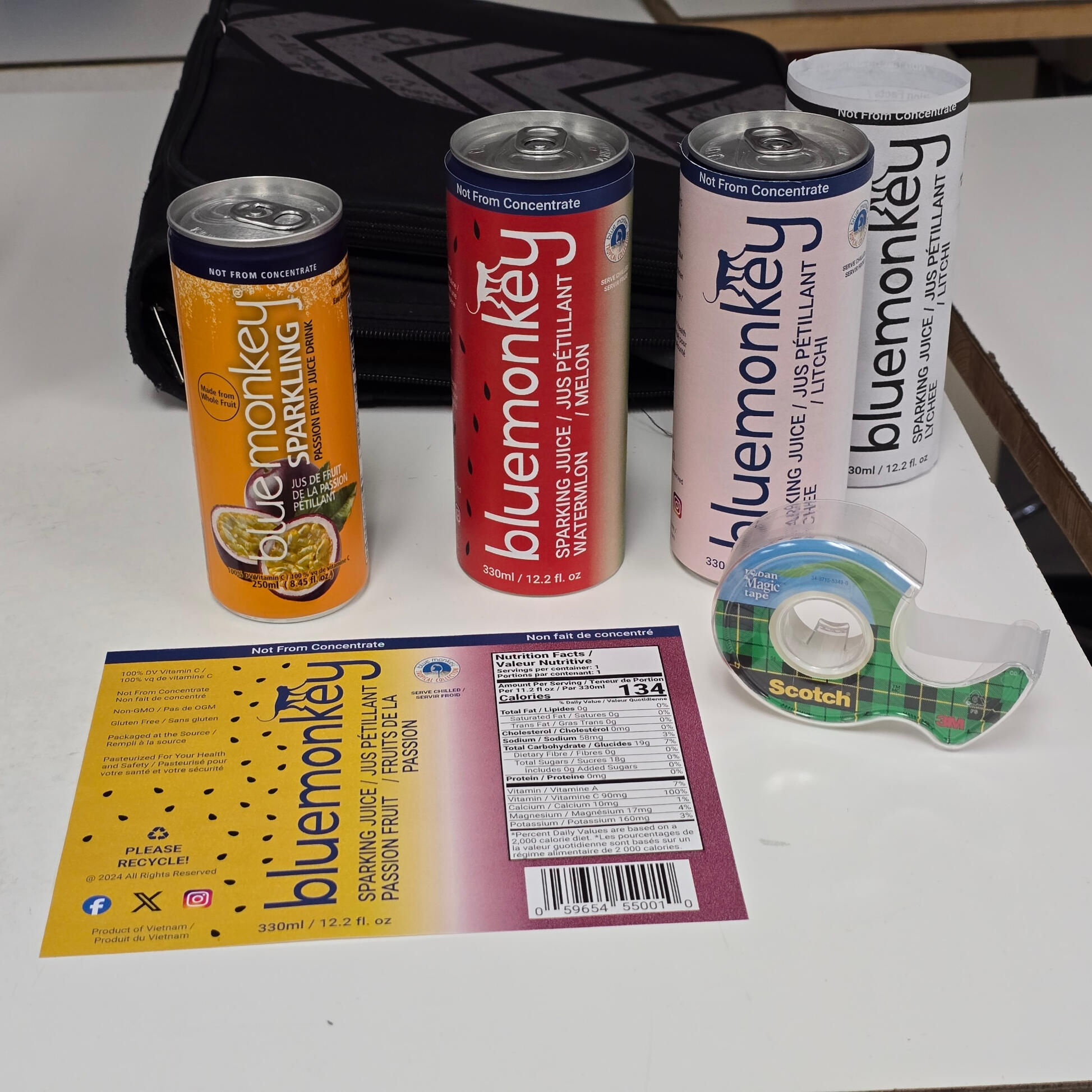
End Results
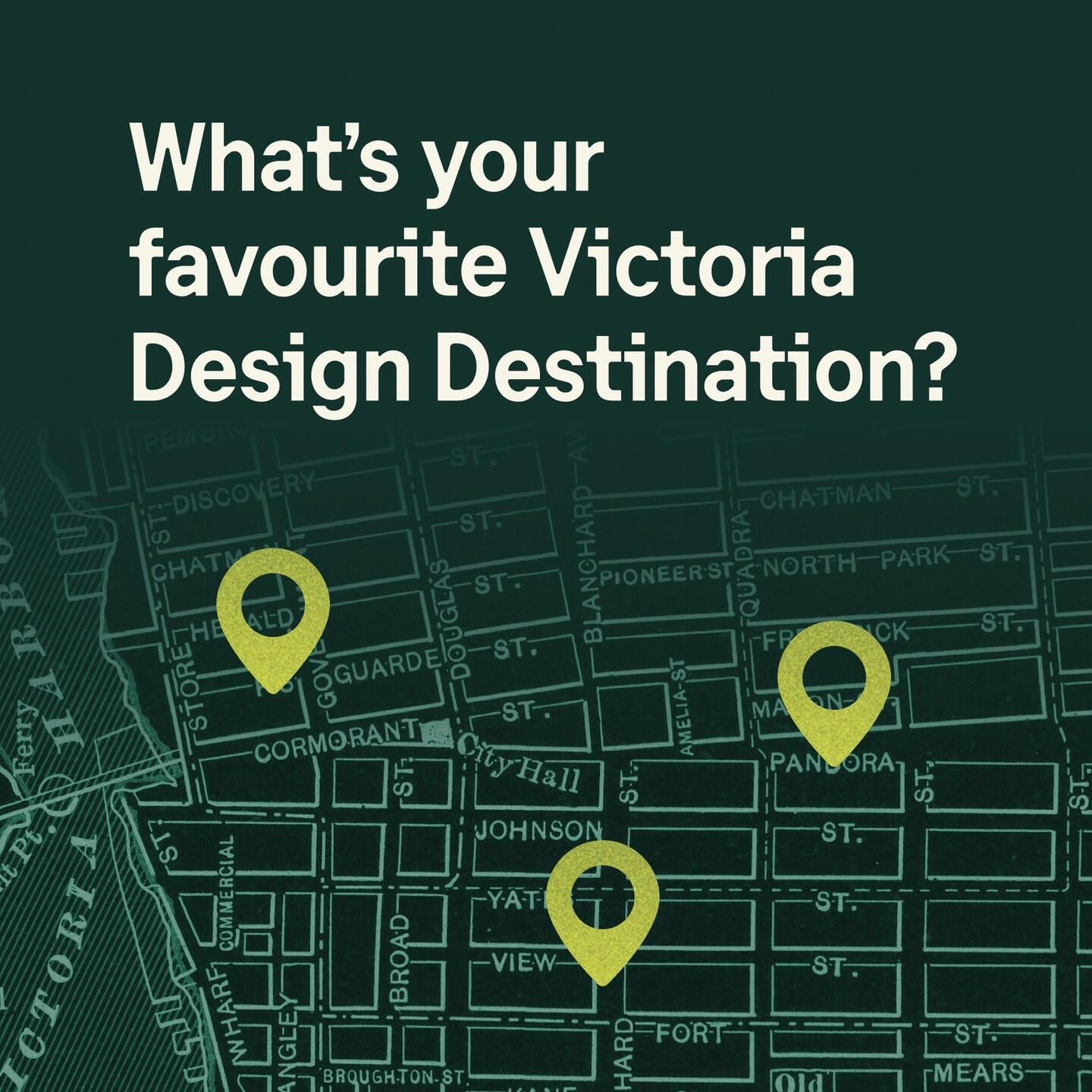
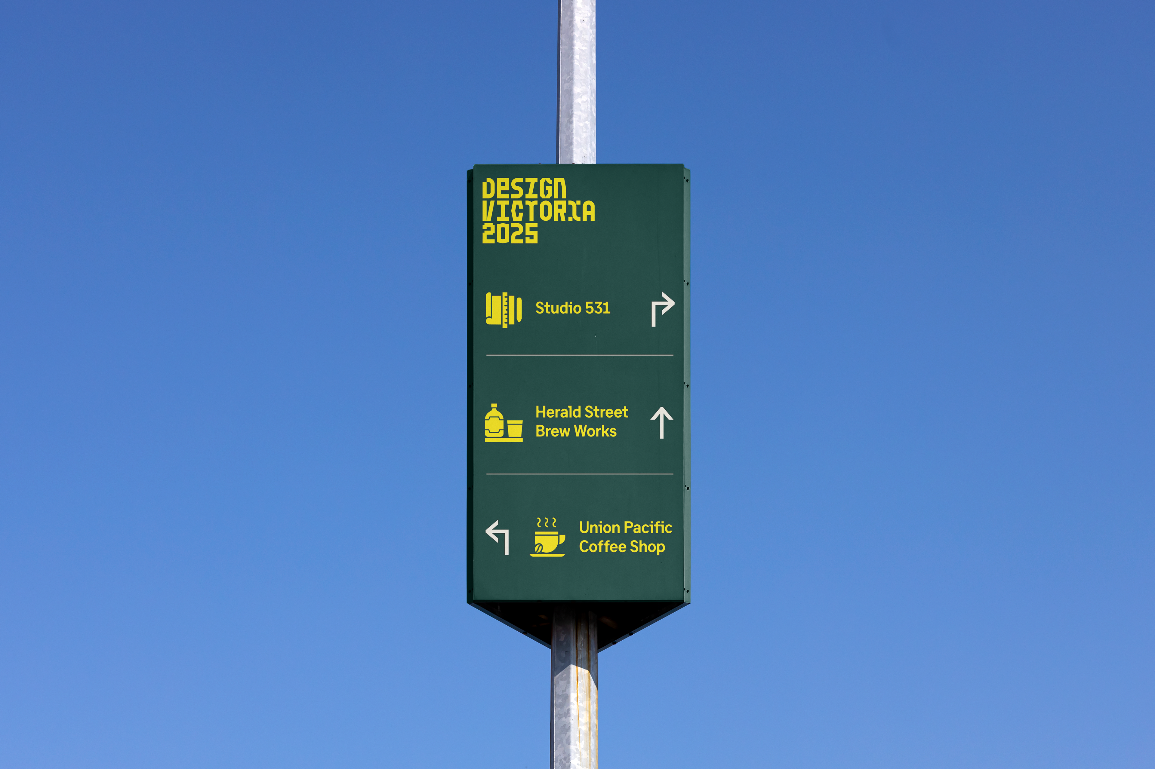
Design Victoria
This project discusses how I used existing branding and design assets to help people navigate and wayfinding their way using signage for an event. Also learning how to present potential solutions to the clients using mock-ups.
Challenges I Faced
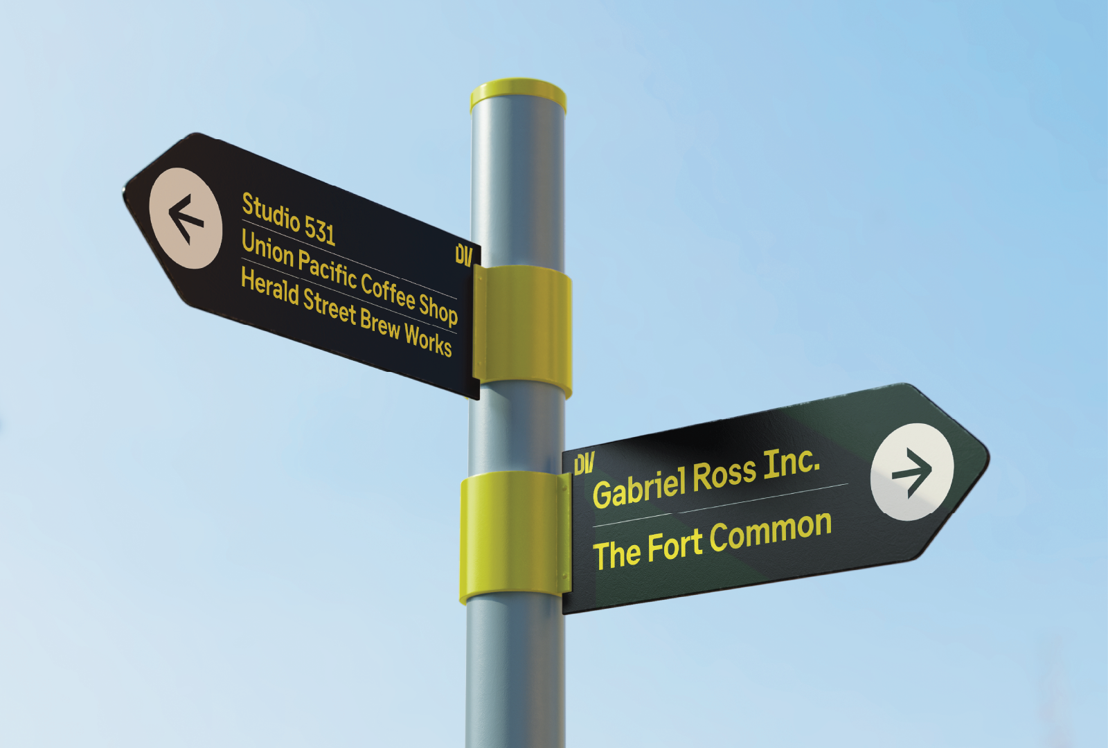
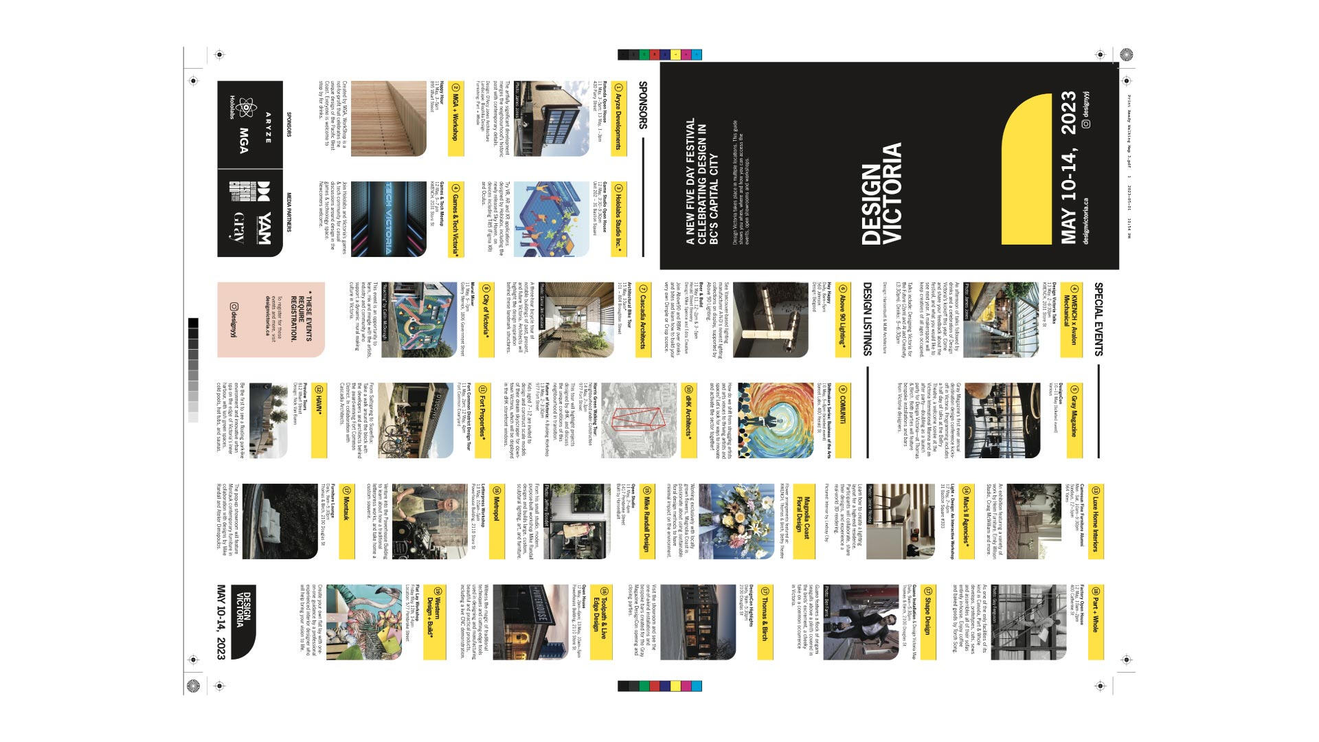
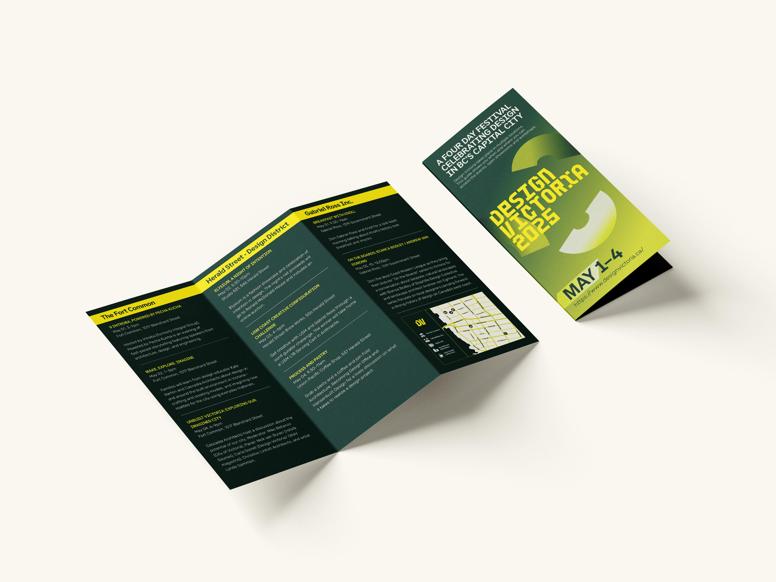
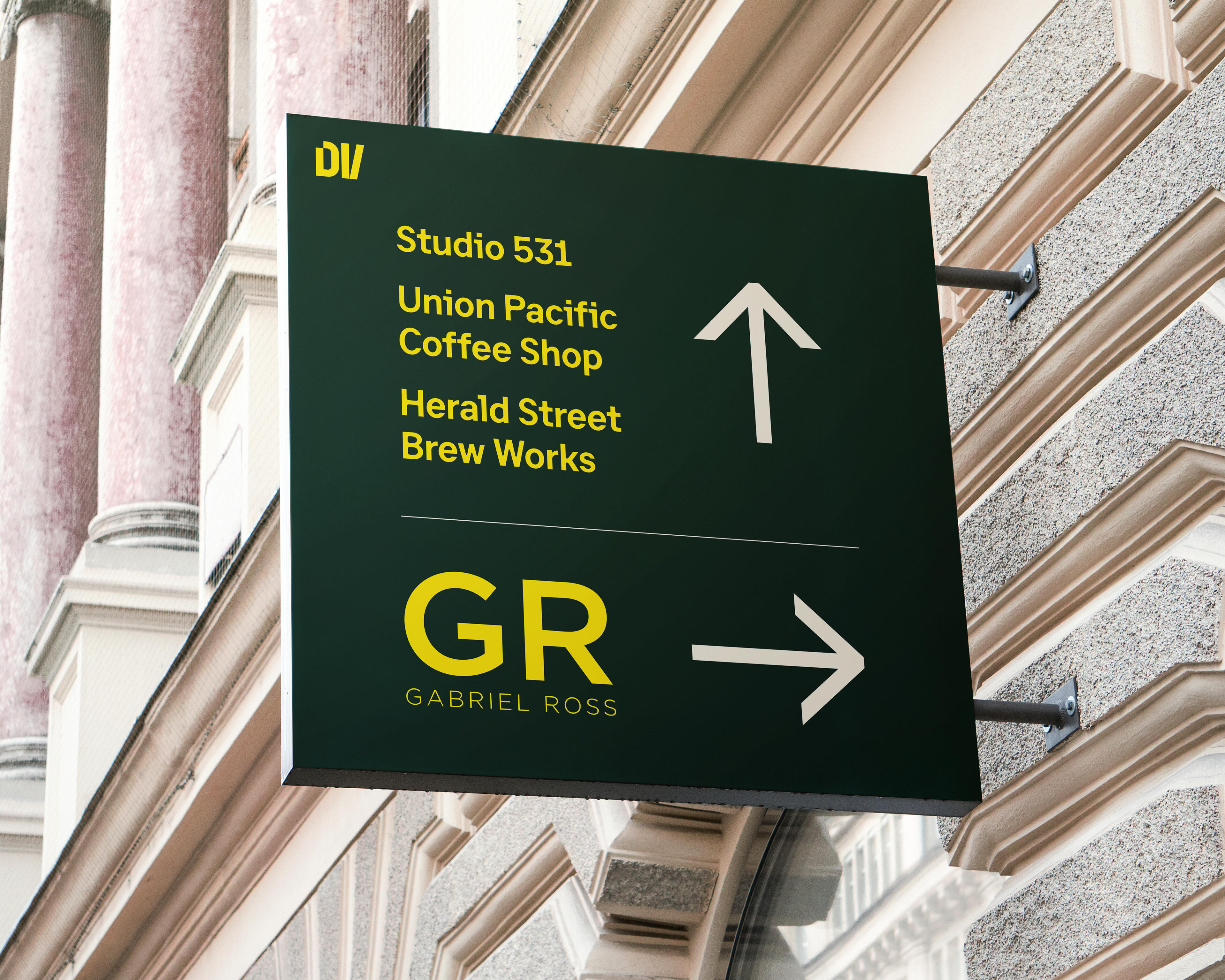
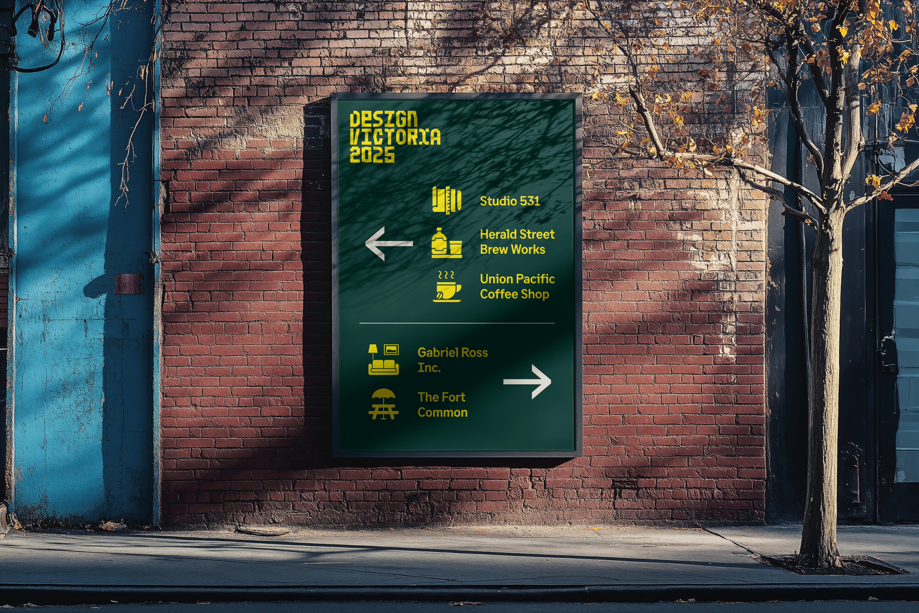
The challenge is to create a wayfinding system for ‘Design Victoria,’ and how can it be implemented into the city of Victoria. With permission given from ‘Design Victoria,’ I was allowed to use their design assets to give me a better understanding on how accessible wayfinding signage can be to navigate through three selected locations I was provided.
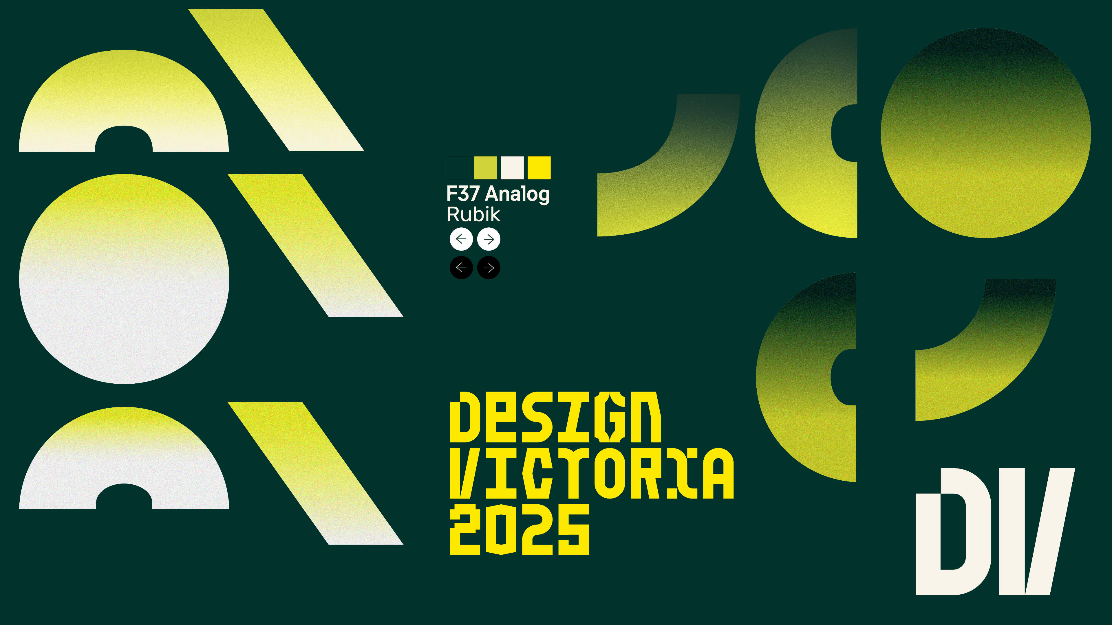
The typeface and logo were both provided by Design Victoria. The elements were taken inspiration from their website at that time.
Project's Approach
I decided to look back at previous years of ‘Design Victoria’ to see how they did their signage and what was their design language before. I also took inspiration from actual roadway signages as well for their bright colours, high contrast, and bold typeface.I had to consider the brand’s identity as well since I wasn’t going to repeat a pattern that previous years had and design trends can change each year. I do need to stay aligned with how ‘Design Victoria’ presents their work and how effective it Is to view their stuff in the hands of the event attendees.
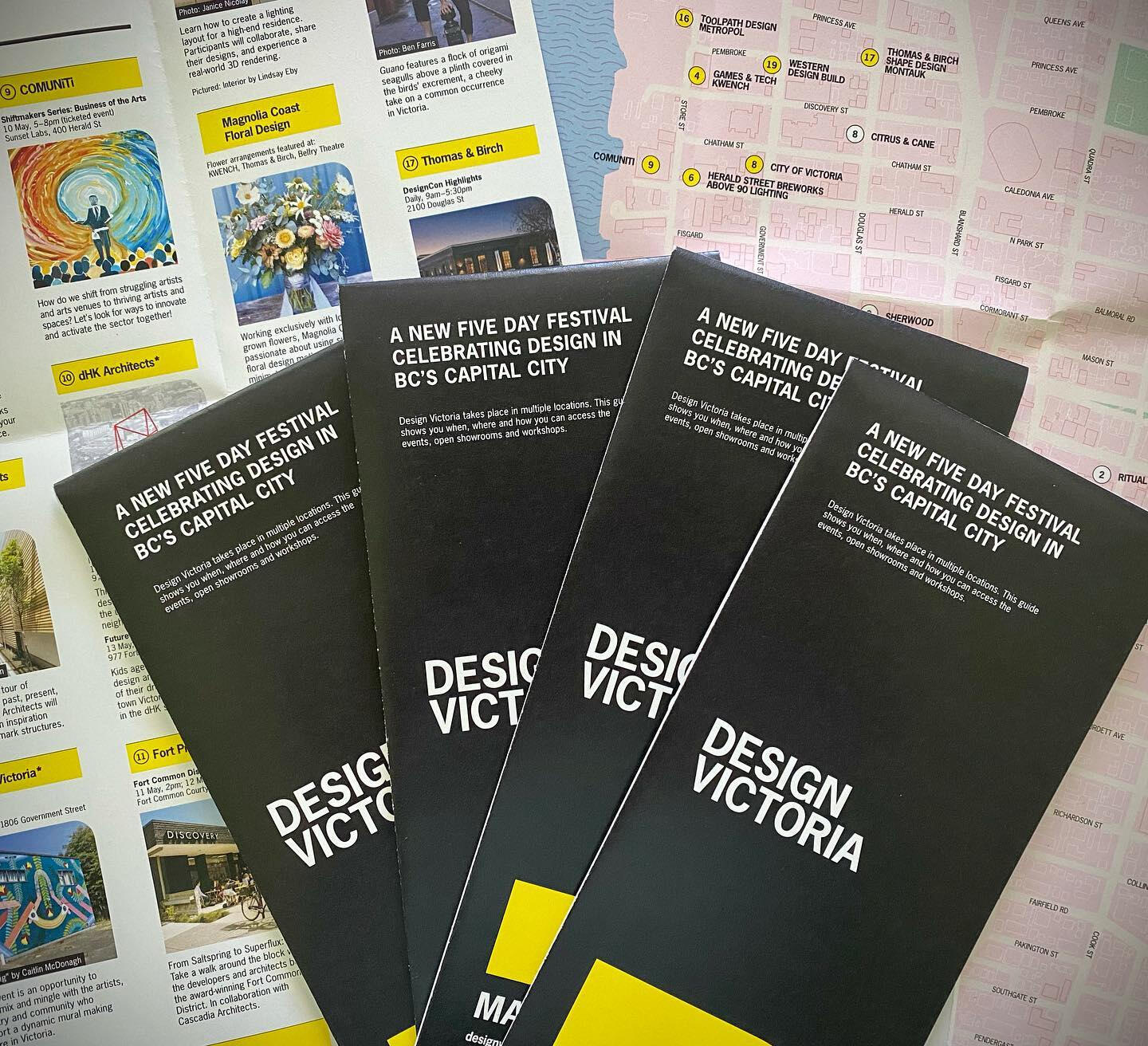
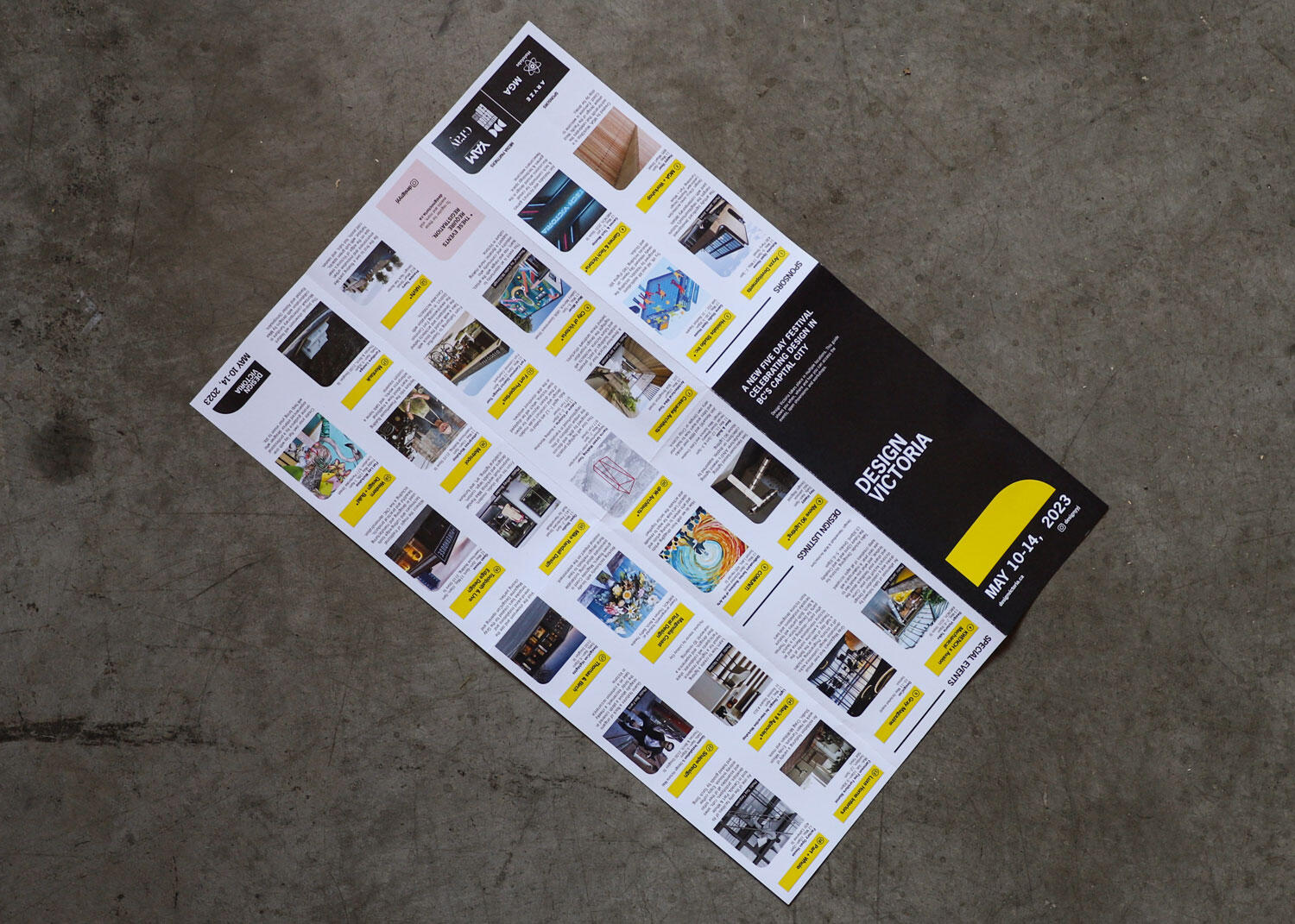
Some of the wayfinding that Design Victoria has made for 2024. Following a similar palette and design, it's best to build upon on their identity for the next upcoming year.
The Eventual Solution
I went with a high contrast theme for my chosen design since it reflects well during the daytime and the yellow text stands out on the dark green background that has great contrast.The directional, pole, and square signs have a small ‘DV’ in the corner showing that it’s the initials to ‘Design Victoria,’ and a clear arrow showing which way to go for the following locations. Use of the logo of the locations was minimal as text displays a lot clearer, and icons were reserved for the billboard.
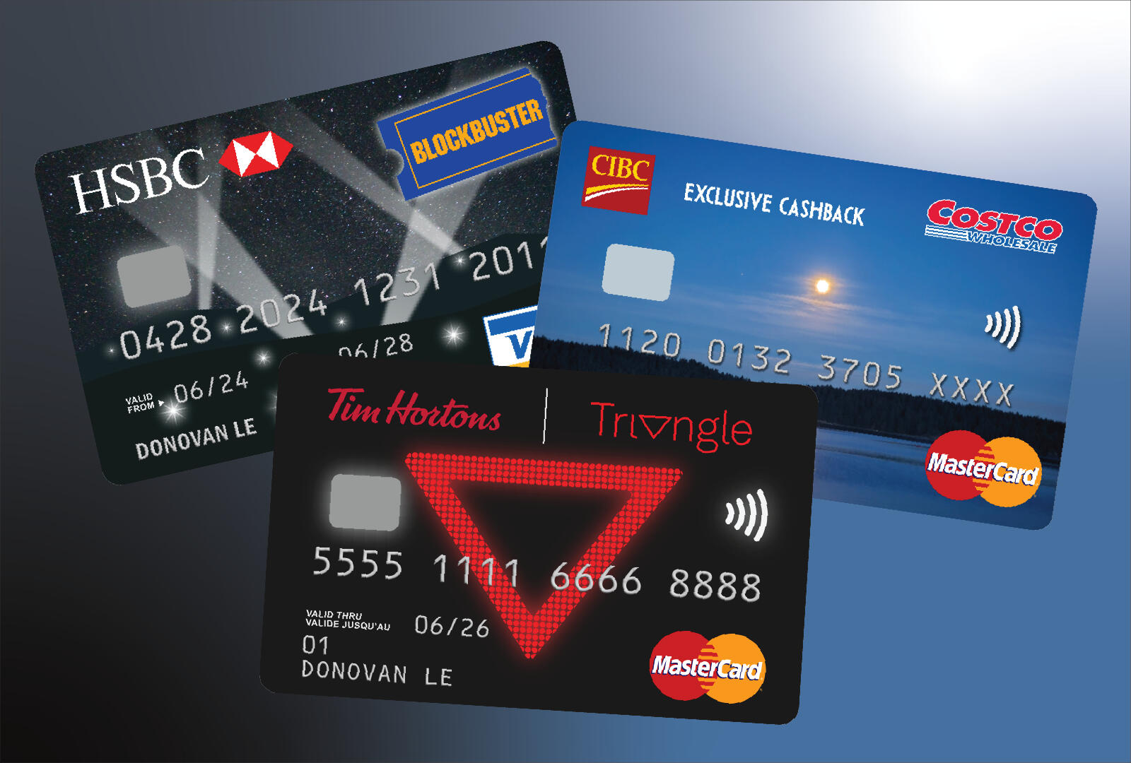
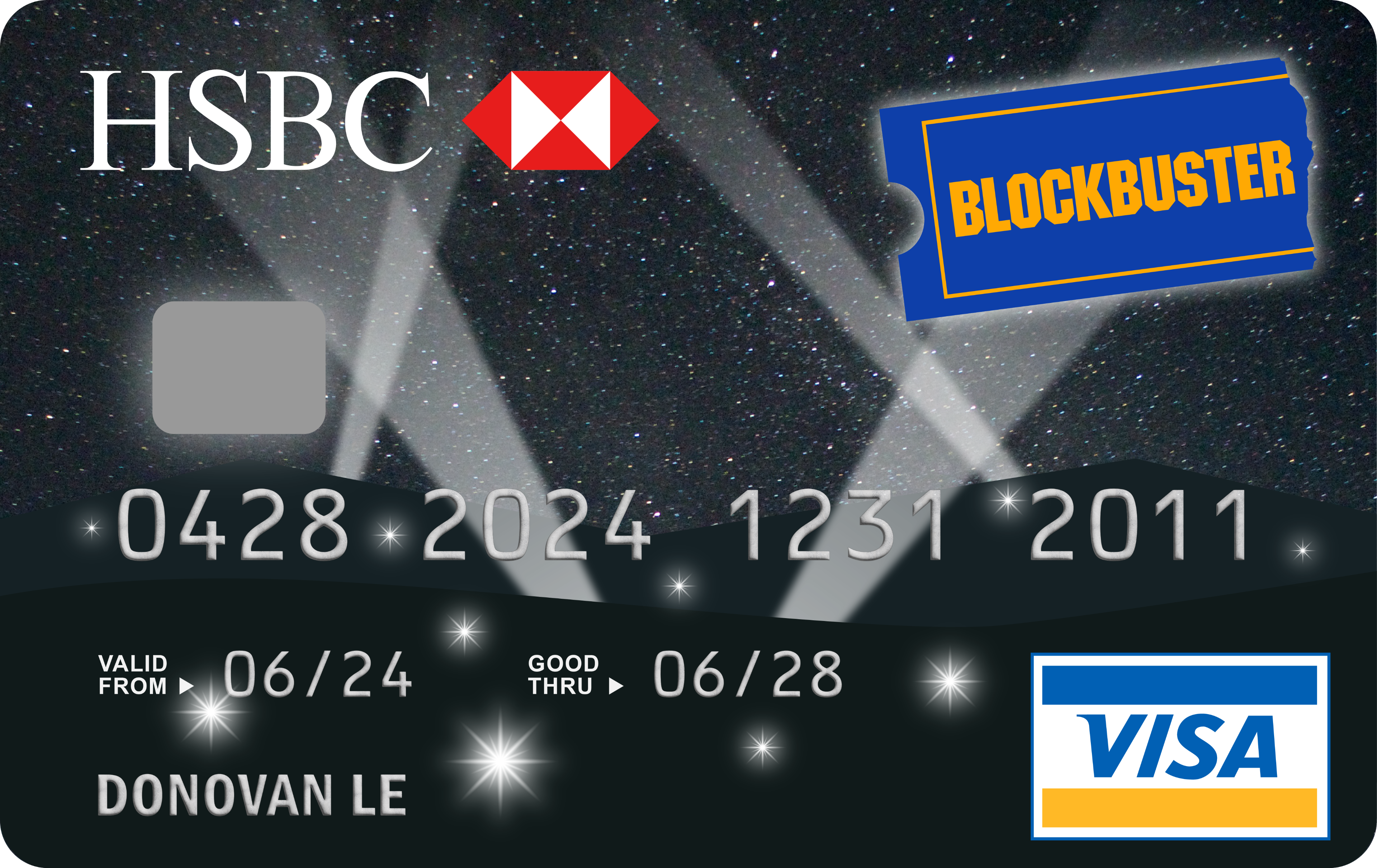
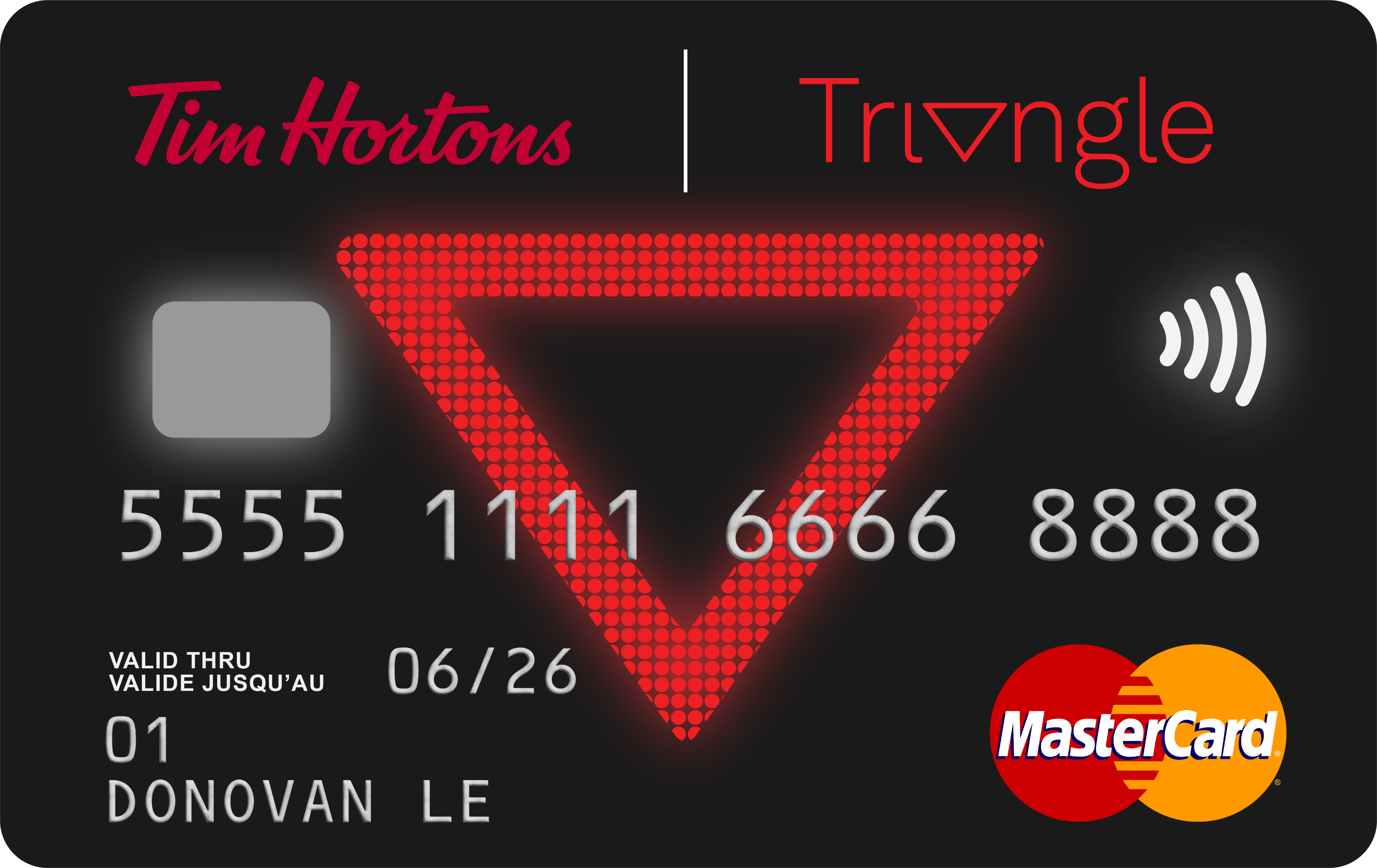
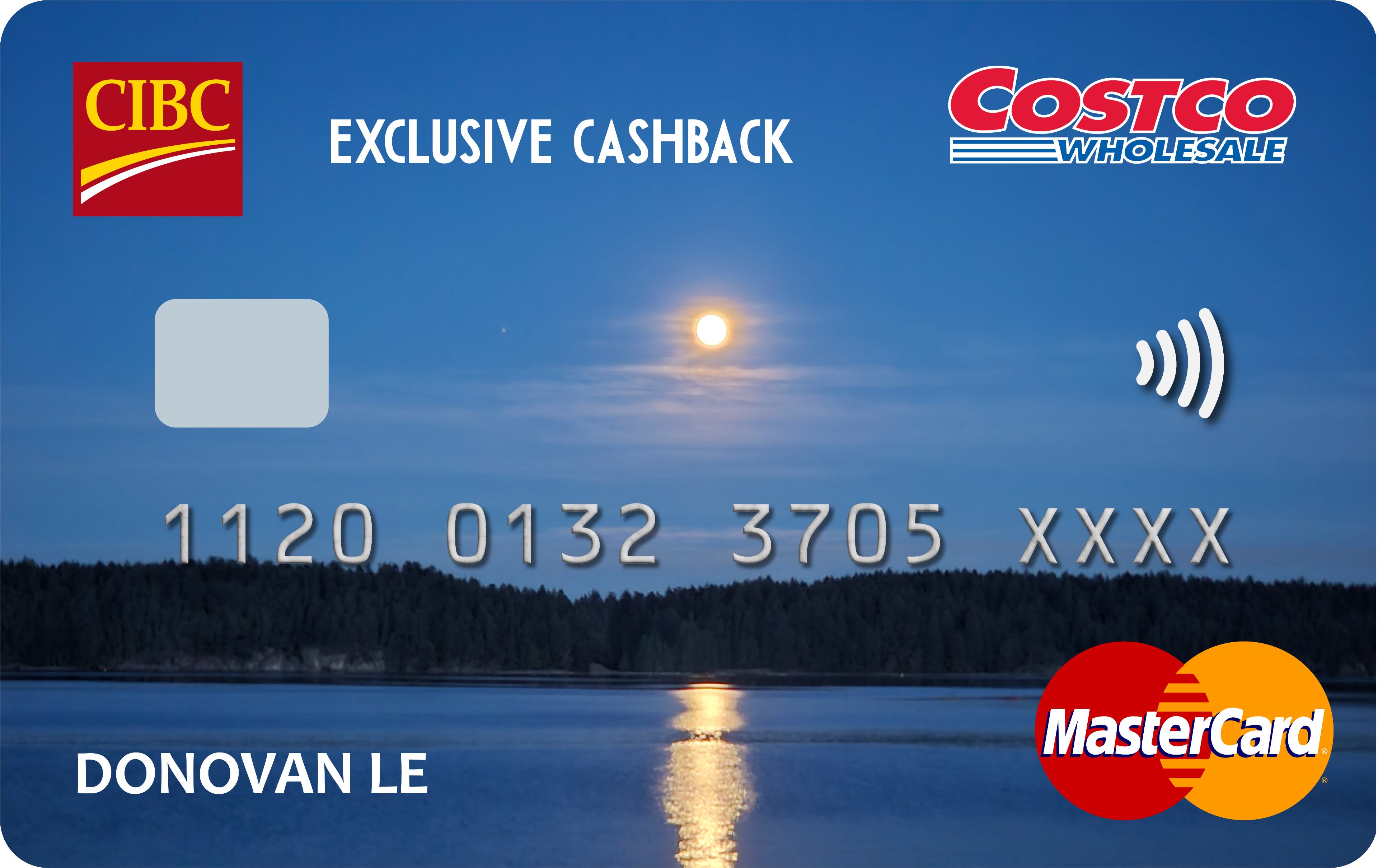
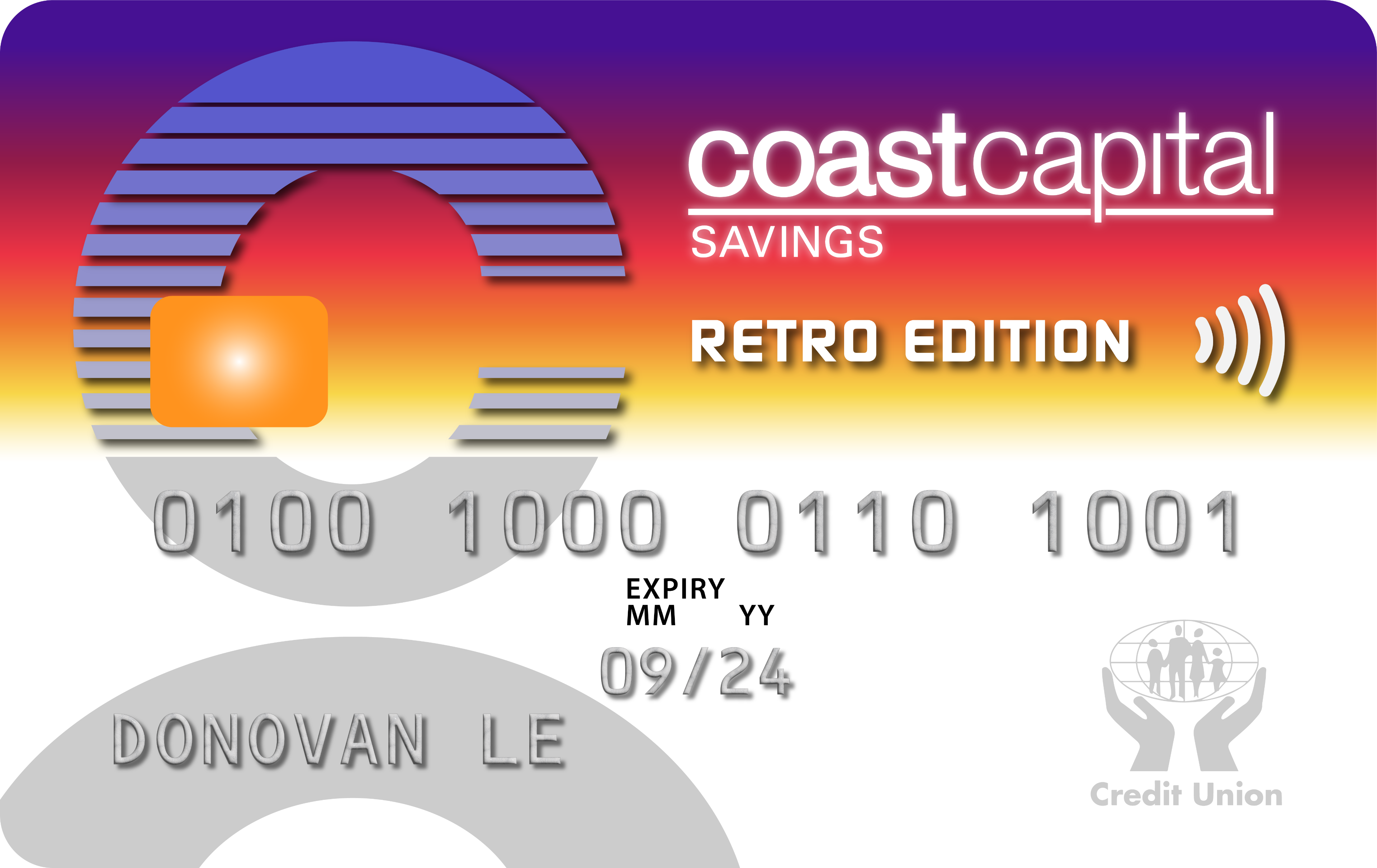
Credit Cards
To give my personal bank cards a bit more character, I took my hands at designing a custom alternative style! Some people have taken notice on my bank cards and was curious on how I got my hands on it.This does certainly generate curiosity among people who might be used to the corporate and professional look of bank cards today.Special thanks to CUCU Covers for allowing the ability to import images to be turned into stickers to place over the actual credit cards!